What is the difference between a Photo and Digital Texture?
Over time, while teaching and creating my own Digital Textures, I noticed something interesting.When we talk about textures, many photographers are actually working with surface photos without realising there’s a difference. That distinction became clear during a conversation with a participant who said, “I realise I don’t have many textures — I mostly have surface photos in my stock library.”
It raised an important question: do we really understand the difference between a Surface Photo and a Digital Texture?
Surface Photos vs Digital Textures


Using the word Surface Photo, I think is a good descriptor, as that is what it is. A photo taken of a particular surface – bricks, peeling paint and so on. These photos are an example of “surface photos” and don’t always make the best texture to use on a photo.
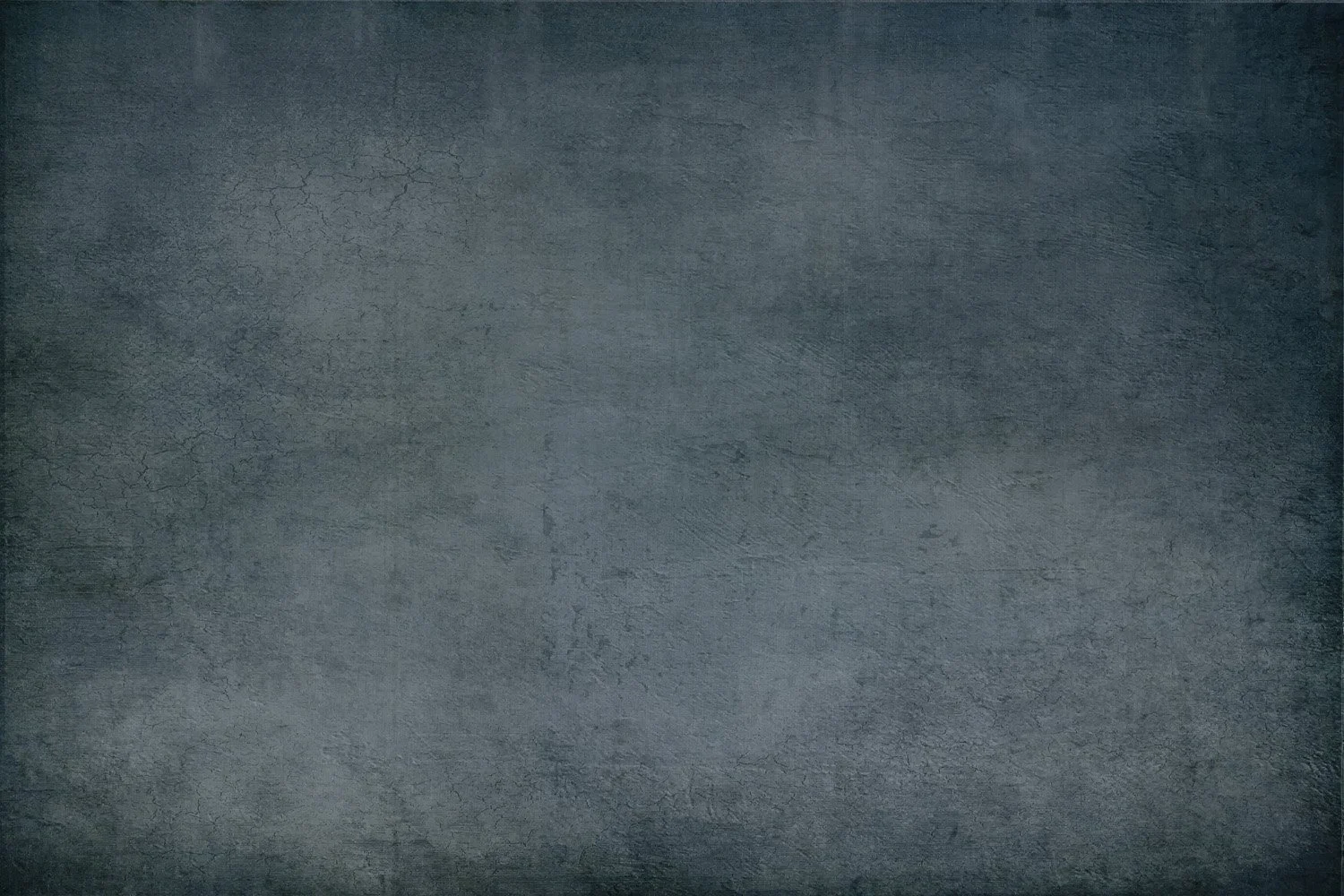
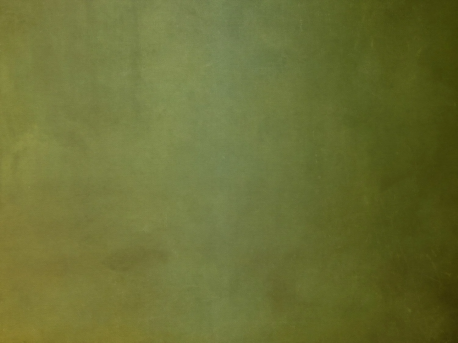
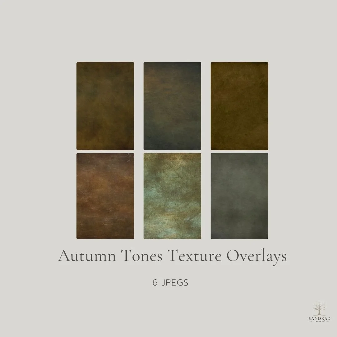
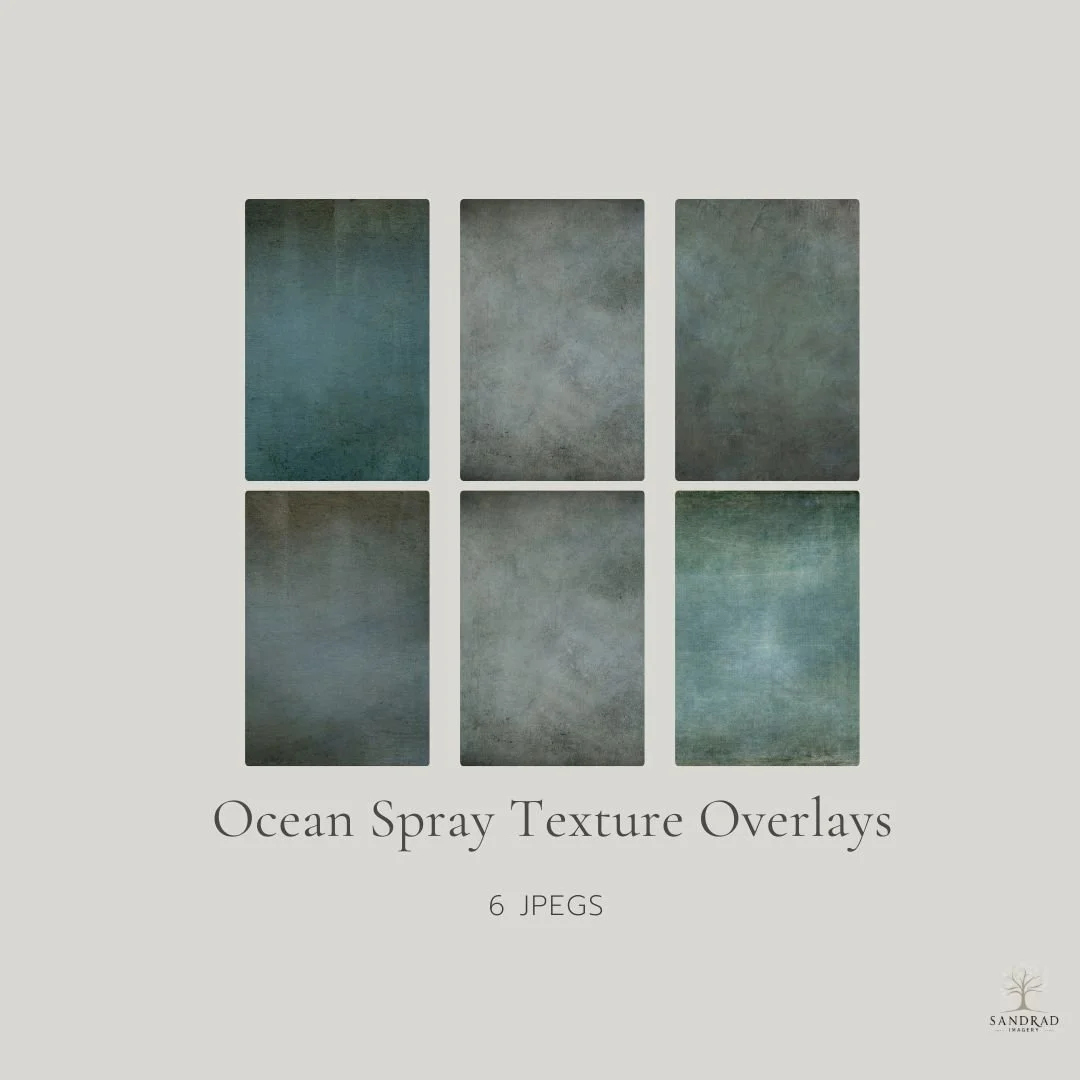
What is a Digital Texture? To me it is a texture that enhances your digital art or photo and compliments it, both in texture and colour. These images are “Digital Textures” which I created using my own photos and different techniques to get the finish I was after.
It can be grungy or subtle, warm or cool, colour-driven or softly textured — sometimes barely visible, sometimes a defining feature of the image.
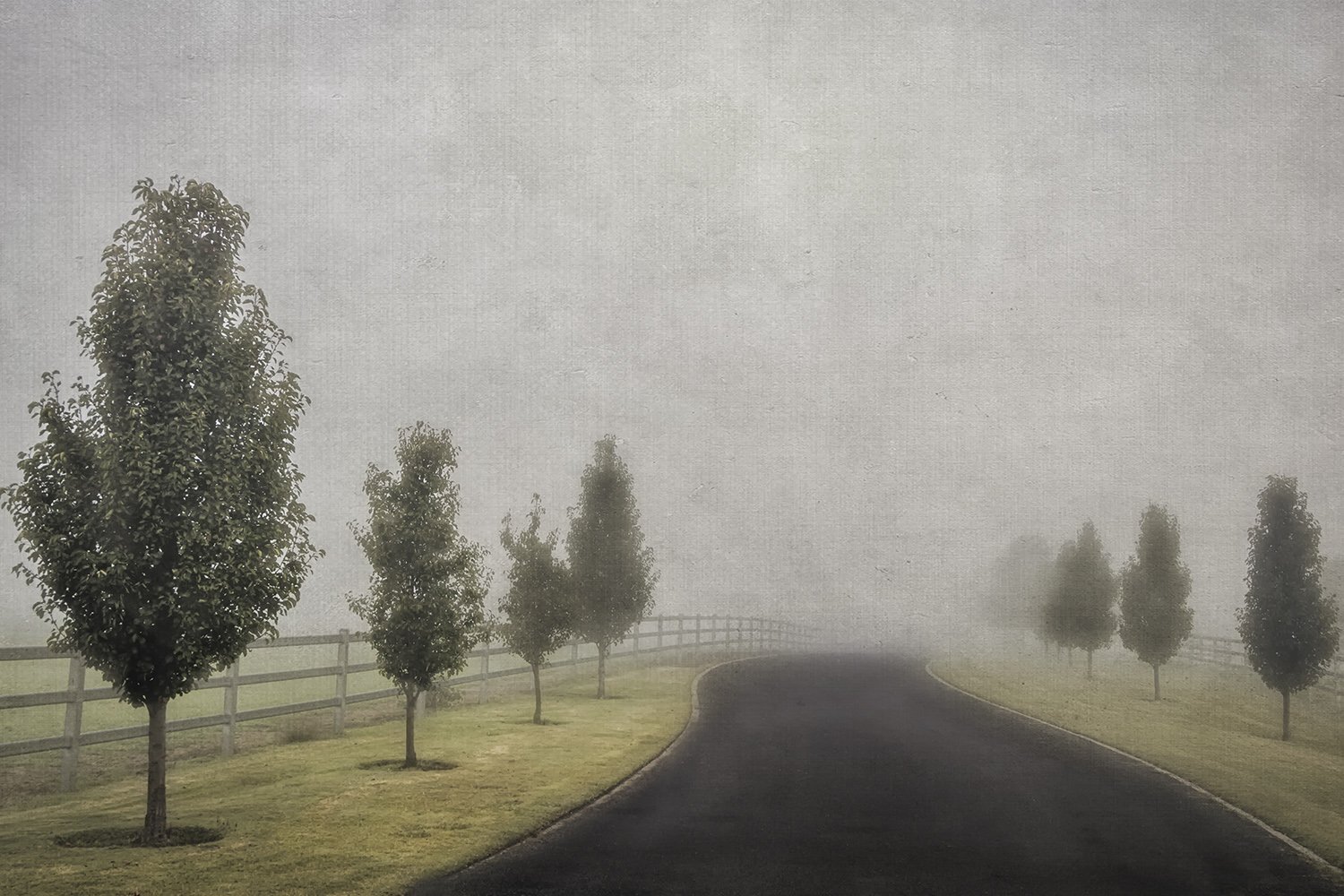
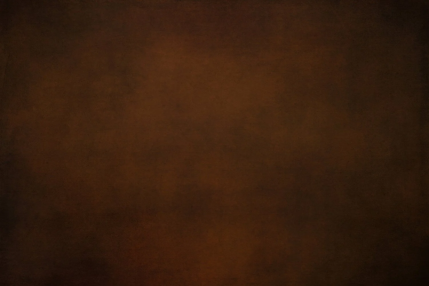
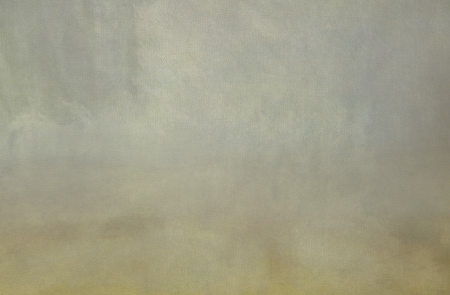
An earlier fine art texture style — using canvas-style overlays to add mood and softness.
A Texture Journey
I didn’t always understand textures the way I do now.
When I first began exploring them in my work, I photographed everything I thought might be useful — concrete, sand, bricks, tree bark, rusted metal, peeling paint — building what I believed was a texture library.
What I didn’t realise at the time was that I was collecting surface photos. When I tried applying them to my images, they often overwhelmed the photo, changed the mood, or simply didn’t work.
That shift came when I discovered texture overlays — textures designed to enhance an image rather than compete with it. These Fine Art Textures were more subtle, colour-aware, and intentional, adding depth and atmosphere without dominating the photograph.
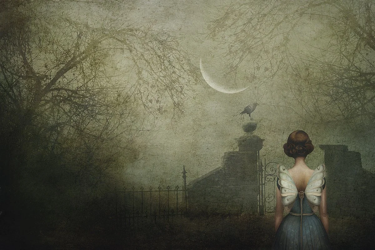
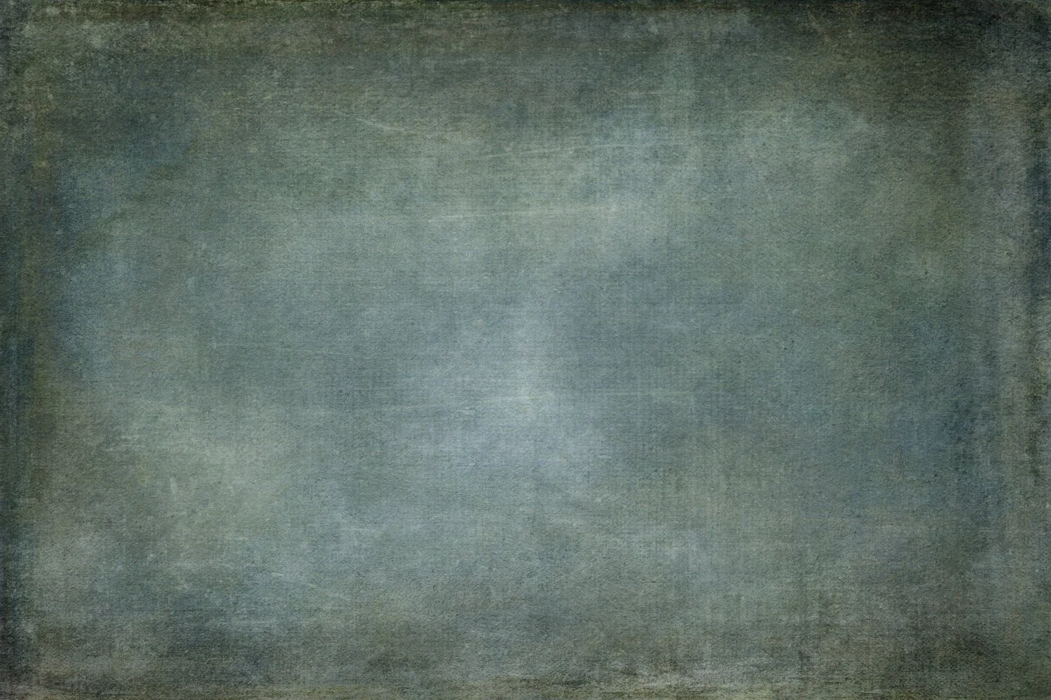
An example of digital textures used to shape mood and atmosphere.
Layered textures help soften the background and bring cohesion to the scene.
Understanding that difference changed how I use textures entirely — and why choosing the right texture is as much about restraint as it is about creativity.
Choosing Digital Textures
Choosing a texture is a personal decision. If you’re new to using digital textures, there is often a period of trial and error while you develop your “eye” for what works. Over time, that instinct becomes clearer — especially when you understand how colour, tone, and texture interact within an image.
Some practical guidelines when choosing a digital texture:
Look at the shapes and lines in your photo.
If your image already contains strong lines or structure, choose a more subtle texture that supports the image rather than competing with it.Consider the colour and tone you already have.
If you’re happy with the existing colour but want added depth or atmosphere, a neutral-toned digital texture can enhance the image without shifting its mood.Decide whether you want to influence warmth or coolness.
If the image needs warmth or cooling, choose a digital texture with similar or complementary tones to gently guide the colour direction.
Why do I add Digital Textures?
I use digital textures intentionally — not to decorate an image, but to guide how it feels.
I’m most likely to add a digital texture:
when the background feels too plain or distracting
when I want to soften or neutralise background elements
when I’m aiming for a more painterly or atmospheric look
when I want to subtly shift colour, tone, or mood
to add refinement and cohesion to a creative image
For me, working with digital textures is similar to building a piece of art in layers. From there, I combine digital textures I’ve created, adjustment layers, and tools such as brushes, gradients, or subtle colour fills to shape the final look. Each layer plays a role, and nothing is added without intention.
Understanding how these elements work together allows you to make confident choices — not just technically, but visually.
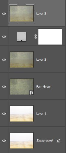
The example shown here illustrates the layered approach behind one of my digital textures, built from my own imagery and refined through colour and tonal control.
To create effective digital textures, it helps to be clear about what you want to achieve — whether that’s softness, depth, mood, or restraint. Experimentation is part of the process, along with the occasional frustration… followed by that quiet “yes, that works” moment.
Creating Digital Textures is part of my workflow
Creating digital textures is a natural extension of how I work creatively. It allows me to explore colour, tone, and surface in a way that feels intuitive — often layering, refining, and adjusting until the texture supports the image rather than competes with it.
Over time, I realised that the textures I wanted to use in my own work weren’t coming from a single surface or formula. They were built through experimentation — combining subtle textures, tonal shifts, and colour control to create something cohesive and flexible.
That same approach is what shapes the digital textures I make available for others. Each one is created with use in mind — designed to enhance an image quietly, leaving room for interpretation rather than dictating a look.
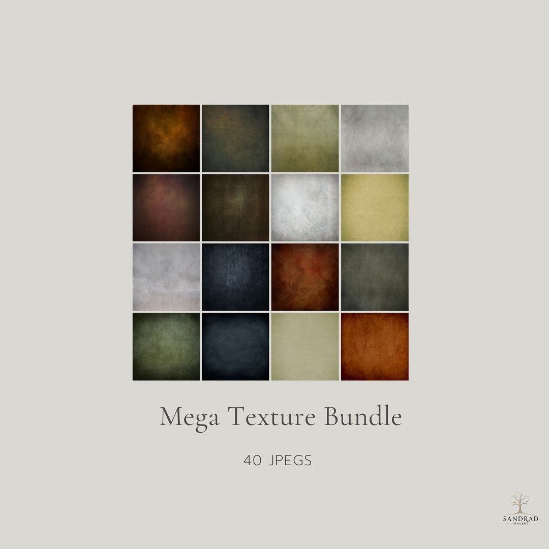
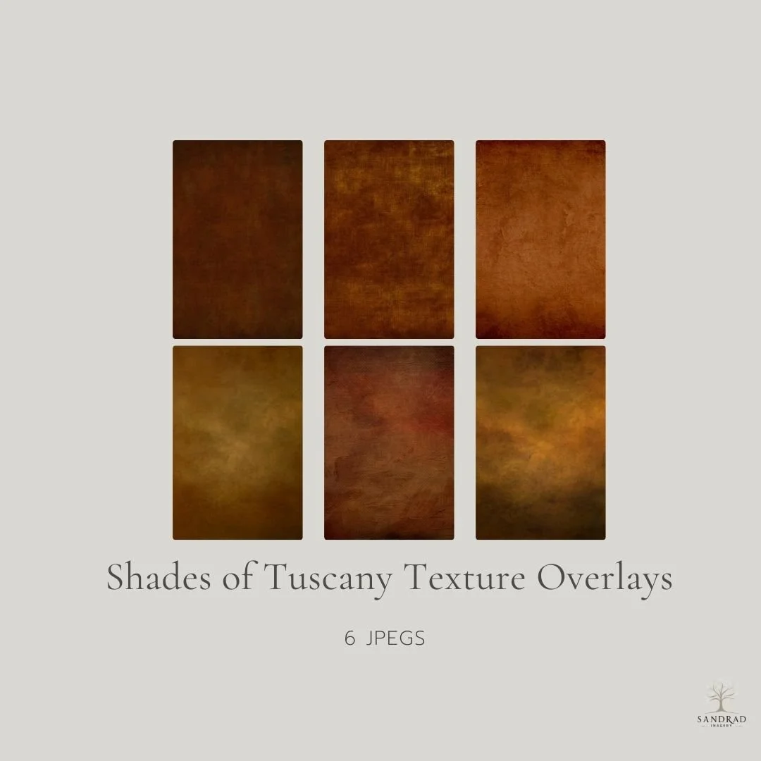
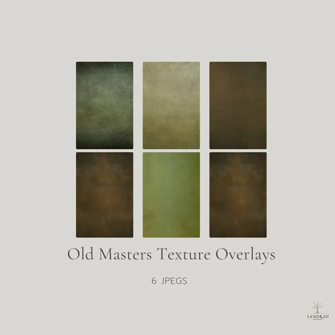
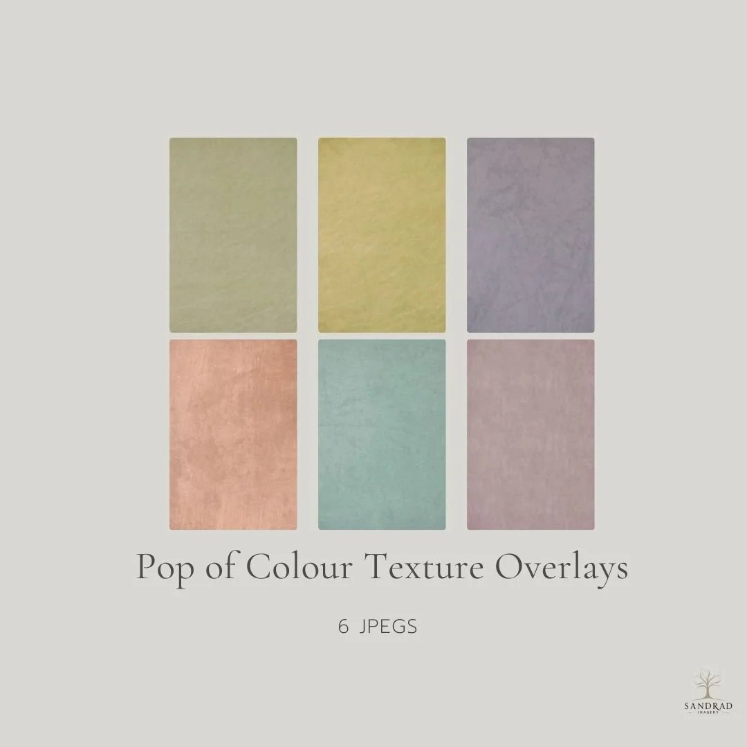
If you enjoy working with textures but don’t want to create your own from scratch, you’ll find a curated collection of my digital textures in the shop — created using the same approach I use in my own creative work.