Transform your images with Textures
“The world always seems brighter when you’ve just made something that wasn’t there before.”

Inspired by the Master Painters
The image and colour palette was inspired by the Old Master Painters, particularly Turner.
How did I create this image?
This image is a composite ~ using a combination of my own photos and a stock photo, several fine art textures (from my Texture Collections) and colour grading techniques to get the look and colour I was after. This artwork was created in Photoshop.
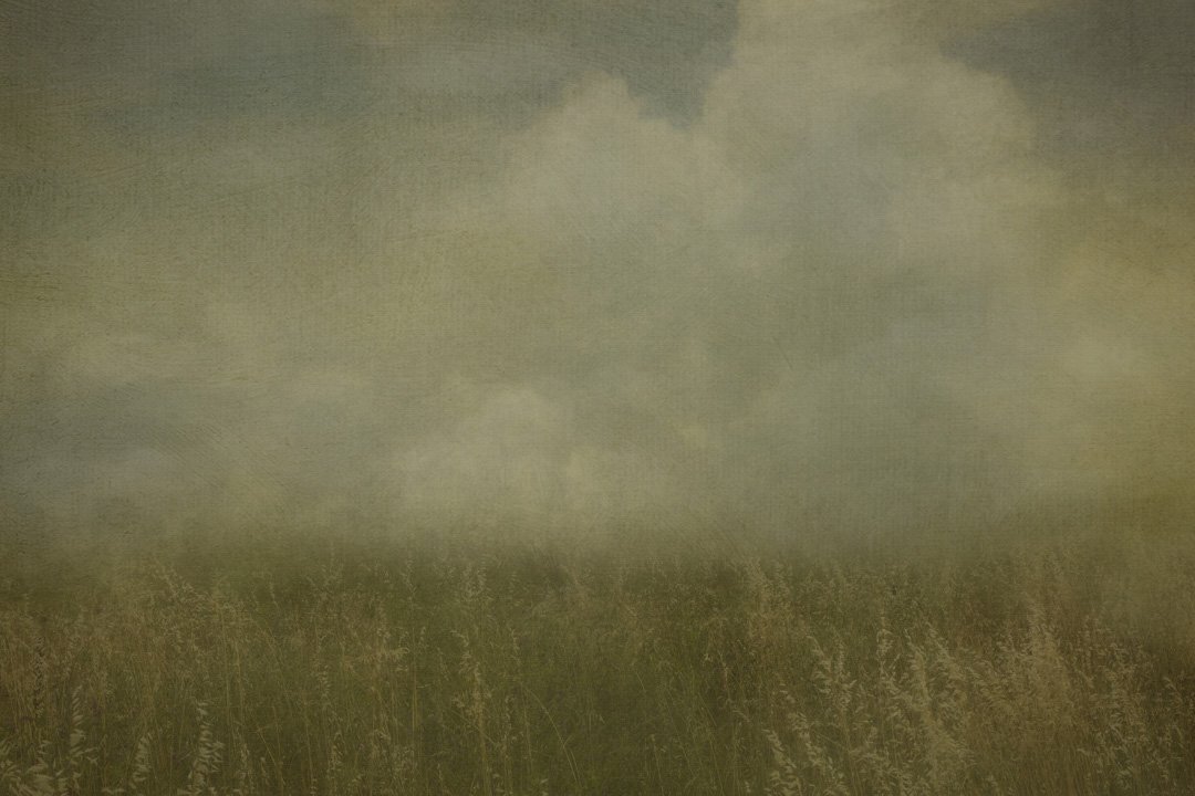
Softly Grass Background Texture
The first layer …
I started with one of my background textures as the base image, I love the soft wheat and it was the perfect foreground to build the composite.
This background was created from 2 of my photos, and I used several texture brushes to give the painterly look. I also replaced the sky with one of my favourite sky textures this gave a lighter feel to the sky then the original sky, as I wanted the tones to be light and airy.
Building from there …
Once that was done, I added another Fine Art Texture Landscape background (the trees) to add depth to the background behind the house.
Then it was a case of adding the house, the bird tree house and my favourite crow (I’ve nicknamed him Charlie and photo bombs quite often) the players were in place.
Now it was up to positioning the elements to make it work for my eye, I wanted to give a sense of space (or negative space), my style is about simplicity and colour.
“Make the fake” look real
Next was the blending of the elements ~ house and bird house into the foreground. To do this I use grass brushes and masking techniques ( blending the elements in a composite image is about “making the fake look real”. Having a selection of grass brushes gives you options to help the blending technique, a soft round brush doesn’t do the job.

Sherton Sage Fine Art Texture
How did I get the colours?
I was happy with the composition, so now the colour grading started. As mentioned, I was inspired by the Old Masters and the colours they used. To achieve this I used several of my Digital Textures from the Renaissance Collection, the one I used was Sherton Sage, this gave it the yellow/greens I was after.
I will often use several fine art textures for my colour grading in my creative images. The colour grading really started with my choice of a Digital Textured Backgrounds, which had the base colours and tones I had in mind, I then built on that to get the finished result.

The Base layer and elements
What Photoshop Adjustment Layers did I use?
Then I added several Photoshop Adjustment layers ~ levels, curves, vibrance, photo filter for the finishing touches.
Photoshop Techniques
Creating a composite image requires several skills and an understanding of the tools to use in Photoshop.
Transform Tool to position and resize elements
Masking techniques
Adjustment Layers
Colour Toning Technique (this adds a Colour Layer to tie the colours together watch my video how to do this)
Photoshop Brushes
If you would like to develop your skills to create a composite image I have a Basic Composites Bundle, where I show how to combine the skills to create a composite to get you started.
The finished image
In all 14 layers were used to finish the image. It started as a “play image” , an image where I feed my creative soul and to express the colours and vision I have in mind.
Playing and creating an image for no other purpose than enjoyment helps fine tune the skills.
Why create artwork using Digital Textures?

Inspired by the colours of the Old Masters period where they used mostly earthy colours. These textures add depth of colour and subtle texture to give a richness in your creative images.
These textures can be used anywhere in your workflow, beginning, middle or end. Use textures with different blend modes and opacity for subtle effects or use them full strength for a bold statement. The bonus variations give you even further artistic choices.
What is included:
These textures are designed with a deep rich texture finish, add colour AND tone to your image. I use these texture overlays for colour grading as well.
6 Textures handcrafted by me using my own photos and brushes
High quality JPEGS around the 5000px on the longest edge
Print quality at 300 dpi
Downloading your Textures
You will receive an email with the downloadable link, once payment is confirmed. This link is only available for 24 hours to download.
For me it is about expressing myself as a creative, I use the camera to capture the elements I want (I’m always building up my elements for my stock library) if I have an idea I will use a stock image so I can create that idea. The creative tool for me is Photoshop, which allows me to create images I have in mind or have been inspired by.
Using Digital Textures in my workflow gives my images can give a painterly feel and a depth of colour I can’t create with other techniques. My textures I create are for colour grading or adding some texture to the image, it is not always about choosing a Photoshop Fine Art Texture for a scratchy, grungy, dark look.
There are no limitations to using Digital Textures to create an image.