Using Visual Metaphors in Digital Art
If you enjoy exploring creativity, Photoshop and visual storytelling, you'll find more tutorials, articles and creative resources throughout my Learning Hub.
If you've ever looked at a composite image and felt something before you could explain why, you were probably responding to a visual metaphor. It's one of the most powerful tools available to a digital artist, and one of the least talked about, because it isn't a technique you learn in a tutorial. It's a way of thinking that changes what your work can say.
What a visual metaphor actually is
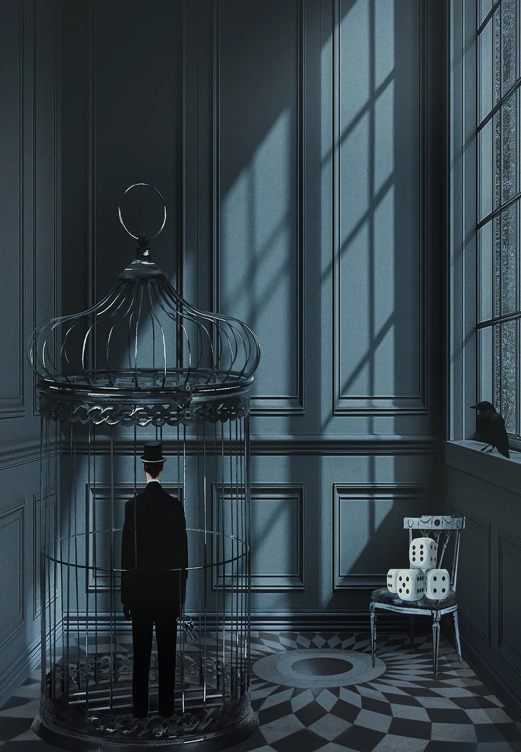
The image explores ideas of confinement and chance, restriction chosen or imposed.
A visual metaphor is an image within that scene that stands in for an idea it isn't literally showing. It's the same move as a metaphor in language, "time is a thief," except instead of words doing the work, a picture does. Put a bird in a cage, and you're not making an image about birds. You're using the cage to say something about restriction, and the bird to say something about the thing being restricted.
It's worth separating this from a symbol. A symbol is usually fixed and agreed-upon, a dove means peace, a skull means death, and most people read it the same way regardless of context. A visual metaphor is more personal and more constructed. It only fully makes sense within the specific image you've built around it. That's what makes it yours rather than borrowed.
Why it's worth exploring as a creative
This is where visual metaphor pays off beyond just "looking clever." Work built around a genuine metaphor gets remembered. It gives a viewer something to sit with, a small puzzle to solve or a feeling to recognise, rather than a nice image that scrolls past in a second. For you as the artist, it changes the process too. Instead of asking "what looks good together," you start asking "what says what I mean," and that question tends to lead to more original, more personal work than reaching for whatever's visually popular.
Start with the feeling, not the object
It's tempting to reach for symbols first. A crow means this. A key means that. But symbols borrowed off a list rarely feel true in your own work, because you didn't arrive at them, you just applied them. Instead, start by naming the feeling or idea you're circling. Containment. Waiting. A held breath. Only once you know what you're trying to say should you go looking for the image that says it.
When I built my bell jar composite (pictured above), I wasn't thinking "I should use a bell jar because it's a classic symbol of preservation." I was thinking about something being kept safe and kept apart at the same time, protected and isolated in the same gesture. The bell jar came after that thought, not before it. The paper flower inside it followed the same logic, something delicate, something made rather than grown, sitting inside that protection.
How to actually use one in your work
Once you've named the feeling, try this:
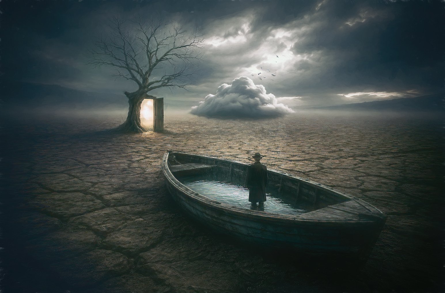
The image plays with contradiction, a boat with nowhere to sail, water contained rather than surrounding, a door offering passage out of a landscape that has nowhere obvious to lead. It's a good example of layering more than one metaphor into a single scene, the boat and the doorway both speaking to different ideas of escape, without either one over-explaining the other.
List three or four objects, scenes or actions that carry that feeling for you personally, not the obvious cultural shorthand.
Pick the one you can explain in a single honest sentence, without reaching.
Build the rest of the composite to support that one idea, rather than layering in extra symbols that dilute it. One clear metaphor beats three competing ones.
Sit with the finished image and ask if it says what you meant, or if you're talking yourself into it because you've already put the work in.
I used this same process with a completely different feeling in an earlier piece, a crow and a set of dice inside a birdcage, working through ideas of chance and confinement rather than preservation. Different objects, same underlying question each time: what am I actually trying to say, and what image says it without words.
Let the metaphor do quiet work
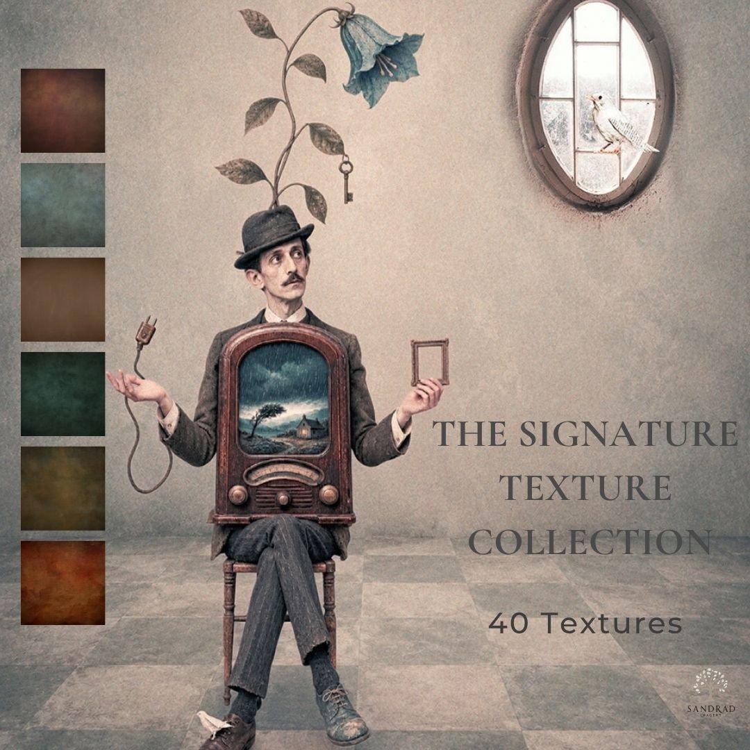
40 versatile textures for adding colour, atmosphere, depth and character to your creative work.
The Signature Texture Collection brings together 40 of my favourite textures in one versatile collection.
Created from my own photographic and handcrafted texture work, the collection includes a broad mix of soft painterly surfaces, subtle neutrals, earthy tones, rich colour, atmospheric textures and stronger distressed finishes.
Rather than every texture having the same look, this collection is designed to give you choice. Reach for something subtle when an image needs gentle depth, introduce colour and atmosphere, or use one of the stronger surfaces when your artwork needs more character.
Use them individually or experiment with blending modes, opacity, masks and combinations to make the effect entirely your own.
What’s Included
40 high-resolution JPEG textures
A varied mix of light, dark, warm, cool and neutral tones
Soft painterly, atmospheric and distressed surfaces
Suitable for digital art, photography and composite imagery
Files standardised to 4000 px on the longest edge
Instant digital download
Creative Uses
Use the textures to add atmosphere and depth, introduce or unify colour, soften areas of an image, build painterly character, create aged or distressed effects, or simply experiment with different finishing treatments.
They can be used in Photoshop and other image-editing software that supports JPEG files, layers and blending.
Instant Download
This is a digital product. No physical item will be shipped.
Your files will be available to download after purchase. Please download and save your files promptly, as download links may expire.
Terms of Use
Personal and commercial creative use permitted.
You may use these textures in your own finished artwork, composites, photography and client work.
The original texture files may not be resold, redistributed, shared, given away, extracted or claimed as your own. They must form part of your own creative work and must not be supplied in a way that allows the original files to be extracted or reused.
Single-user licence. Copyright remains with SandraD Imagery / Sandra Dann. Purchase does not transfer ownership of the original files.
Full Terms of Use are included with your download.
Refunds
Due to the digital nature of this product, purchases are non-refundable once downloaded, except where required under Australian Consumer Law.
The strongest metaphors in composite art rarely announce themselves. They sit in the image and let the viewer arrive at the meaning on their own timeline, sometimes in the first three seconds, sometimes only after they've looked twice. If your metaphor needs a caption to make sense, it's probably not doing its job yet. Push it further or simplify it, rather than propping it up with text.
Try it yourself
Next time you're staring at a blank canvas with a feeling you can't yet name, resist the urge to reach for the obvious symbol. Sit with the feeling a little longer. Then ask yourself: what's one object in your everyday life that already carries that feeling for you? That's usually a better starting point than any symbol dictionary.
Continue Exploring
If you enjoyed this article, you might also like:
Using Scale and Tension
◾Scale and Tension can add a different dimension to your art.