Light Isn't Something That Happens to Your Composite
If you enjoy exploring creativity, Photoshop and visual storytelling, you'll find more tutorials, articles and creative resources throughout my Learning Hub.

A composite of my own. The directional light was built entirely in Photoshop, and it's what took this from flat to finished.
Did you know there are so many different light directions to think about when you're building a composite? Not just one general "where's the light coming from" question, but several distinct types, each doing its own job, each capable of quietly making or breaking a piece.
I didn't always think about it this way. For a long time I'd pick an element I loved, drop it into a scene I loved, and wonder why the whole thing felt slightly off. It took me a while to realise I wasn't treating light as its own decision. I was just hoping it would sort itself out.
It won't. So here's how I actually think about it now.
Directional Light
This is the big one, and the one most people mean when they talk about "matching the light." Directional light is simply where the light is coming from. Left, right, above, behind, low and raking across a surface.
When you're building a composite, every element you bring in already has its own directional light baked into it. Your job isn't to create new light, it's to notice what's already there and either work with it or deliberately override it. Skip this step and you'll end up with a subject lit from the left standing in a world lit from the right, and your eye will know before your brain catches up.
Side Light
Side light is a specific kind of directional light worth knowing on its own, because of what it does. Light falling across a subject from the side carves out form. It shows texture, catches the edge of a cheekbone or a fold of fabric, and creates that satisfying push and pull of highlight and shadow across a surface.
I reach for side light a lot when I want a piece to feel sculptural, like the subject has real weight and dimension rather than sitting flat against the background. It's one of the quickest ways to add depth without touching a single blend mode.
Front Light
Front light is the flattest of the bunch, light hitting a subject straight on, minimal shadow, even and soft. It's not dramatic, and that's exactly its use. Front light is calm. It's gentle. It doesn't fight for attention.
I'll use front light when the story of the piece isn't about drama or mystery, it's about clarity, or softness, or a kind of quiet stillness. It's a choice, not a default, even though it often gets treated as one.
Backlight
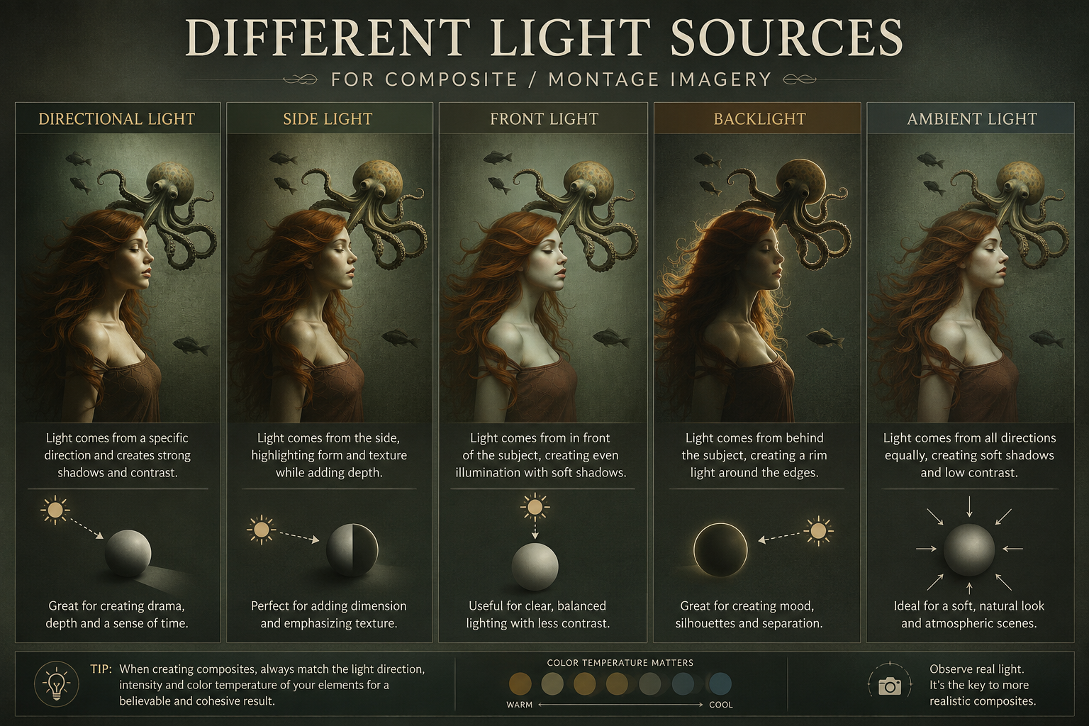
The five light types side by side, same subject, five completely different feelings.
Backlight sits behind your subject, facing toward the viewer. Used well, it creates that glowing rim around hair, fabric or fur, and it's one of the most atmospheric types of light you can build with. Used carelessly, it just silhouettes everything and you lose all the detail you worked to create.
Backlight is brilliant for mood, for a sense of something otherworldly or dreamlike, but it needs a second light source doing quiet work elsewhere in the piece, or your subject disappears into shadow entirely.
Ambient Light
This is the light that isn't coming from anywhere specific, it's the general glow filling a scene, bouncing off walls, filtering through fog, sitting in the air itself. Ambient light is what stops a piece feeling like a subject was just placed on a background. It's the light that makes a scene feel like one continuous space.
I think about ambient light last, almost like a finishing wash, once the directional light is sorted. It's often the difference between a composite that reads as "assembled" and one that reads as "real."
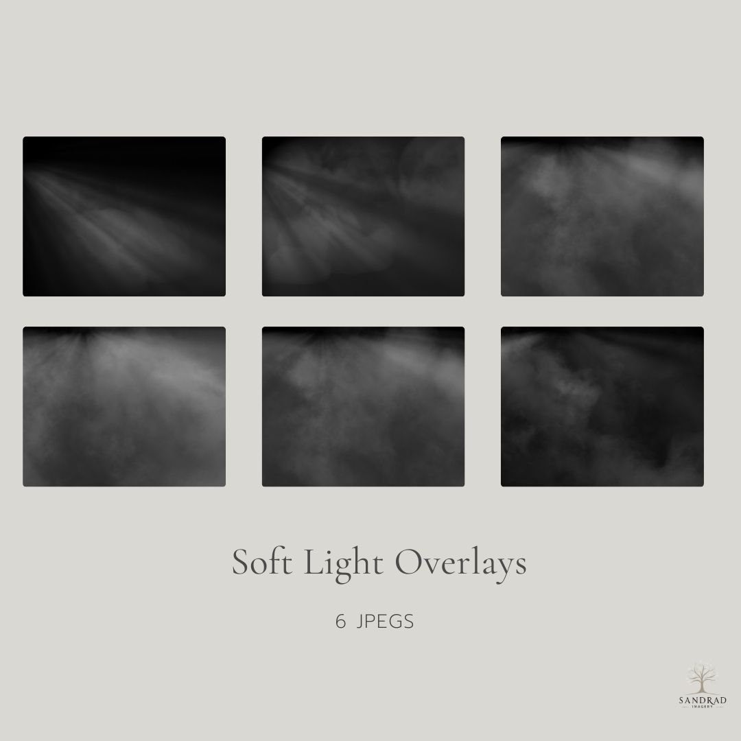
This collection of six soft light overlays is designed to add gentle light, atmosphere, and depth to your images without overpowering them.
Each overlay features subtle light rays making them ideal for composite artwork, digital art, and photography where you want to shape light, guide the eye, or enhance mood in a natural way. These overlays work beautifully when blended at low opacity, allowing you to build light gradually and keep full creative control.
Why This Actually Matters
None of these exist in isolation in a finished piece. Most of my work is built from two or three of these working together, a strong directional light shaping the main subject, a touch of backlight for atmosphere, ambient light tying the whole scene into one world.
The point isn't to memorise these as categories and tick them off. It's to start noticing them, in the elements you're using, in the reference images you're drawn to, in the pieces you admire and can't quite explain why they work. Once you can name what kind of light you're looking at, you can start deciding what kind of light your piece actually needs, instead of hoping it'll come together on its own.
That's really the whole shift. Light stops being something that happens to your piece, and starts being something you choose.
Next time something feels slightly off, look at the light first. It's usually where the answer is hiding.Next time something feels slightly off, look at the light first. It's usually where the answer is hiding.
Continue Exploring
If you enjoyed this article, you might also like:
Why Light Makes or Breaks an Image
◾Light is the thing everyone notices and nobody mentions