Creating Mood with Colours
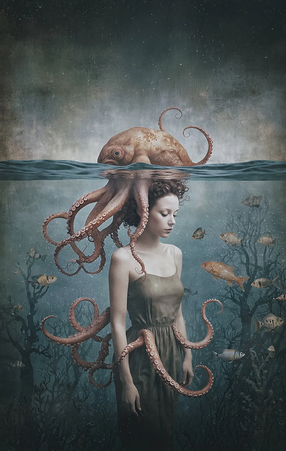
A limited colour palette creates emotional cohesion and atmosphere.
Ever finished a piece of work that feels visually strong — but emotionally flat? That’s often not a technical issue. It’s a colour one.
Colour plays a powerful role in how an image feels. It can suggest calm or tension, warmth or isolation, intimacy or distance — often before the viewer consciously registers what they’re seeing.
Colour theory has been used by artists for centuries to guide emotional response. In film, colour is an essential storytelling tool, helping establish atmosphere, time, and mood. The same principles apply to photography and digital art — colour choices quietly shape how an image is experienced.
Colour Schemes & Mood
Colour schemes provide a framework for creating emotional consistency within an image. Different relationships between colours influence how harmonious, calm, or dramatic a scene feels.
Monochromatic colour schemes
Monochromatic schemes use variations of a single colour. These palettes often feel cohesive, calm, and controlled, making them well suited to quiet or introspective imagery.
Analogous colour schemes
Analogous schemes use colours that sit next to each other on the colour wheel. They tend to feel natural and balanced, creating a sense of flow and visual ease.
Complementary colour schemes
Complementary schemes use colours opposite each other on the colour wheel. This relationship introduces contrast and tension, often increasing visual energy and emotional impact.
In film production, colour schemes are often planned before filming begins. Pixar, for example, creates colour scripts to map the emotional arc of a story through colour, ensuring that colour supports the narrative rather than working against it.
The same approach can strengthen photography and digital art. Thinking about colour relationships before you start editing can significantly influence the emotional outcome of an image.
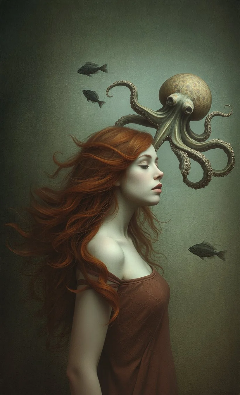
Warm and cool colour contrast draws focus and reinforces mood.
Colour Contrast
Colour contrast is another powerful way to shape mood and direct attention. Strong contrast can introduce drama and tension, while subtle contrast supports quieter storytelling.
In still images, contrast is often used to guide the viewer’s eye. A brighter subject against a darker or more muted background naturally draws focus, helping reinforce mood and visual hierarchy within the frame.
Colour Choices in Photoshop
You may already be making colour decisions every day without realising it. Colour grading is a central part of image creation — not something reserved for the final step.
Adjusting levels or curves, converting an image to black and white, or refining colour balance are all forms of colour grading. Just like in film, colour choices in Photoshop directly influence how an image feels and how the viewer responds to it.
Understanding this shifts colour grading from a technical process into a creative one.
Establish a Mood
Before adjusting any tools, it helps to decide what mood you want the image to convey.
Cool colour palettes often feel calm, distant, or introspective, while warmer palettes can introduce energy, intimacy, or emotional warmth. Establishing this direction early helps guide colour decisions throughout the editing process and keeps the final image cohesive.
Use Contrast with Intention
Contrast isn’t just about brightness — colour contrast plays an important role in visual tension and emotional emphasis.

Bring warmth and richness to your digital art and photography with the Earthy Tones LUT Collection. Designed to add subtle shifts in colour and mood, these handcrafted LUTs are perfect for creative composites, landscapes, florals, and people-based imagery.
Whether you're after sun-drenched warmth, muted neutrals, or deep, moody browns, this collection helps you create images that feel organic and timeless. Each LUT has been thoughtfully crafted as part of my own creative workflow—now you can use them to enhance yours.
Delivery: Instant Download
WATCH how LUTs can transform the colour and mood of your image in seconds
Scroll down to see all the details!
You might be interested in this:
Using contrast intentionally helps draw attention to key elements in an image without overwhelming the scene. When colour contrast aligns with mood, it strengthens storytelling rather than distracting from it.
Colour Grading Tools in Photoshop
Colour grading in Photoshop works best when guided by intention rather than experimentation alone. By deciding on mood, contrast, and palette early, your edits become more cohesive and purposeful — allowing colour to support the story you’re trying to tell.
Rather than thinking of colour grading as a set of effects, it helps to approach it as a series of creative choices.
Curves
Curves are ideal for shaping contrast and tonal mood. They allow fine control over highlights, midtones, and shadows, making them useful for subtle emotional shifts without heavy colour changes.
Hue / Saturation
Hue and Saturation adjustments help refine the intensity and balance of individual colours. They’re useful for softening dominant tones, boosting key colours, or bringing a palette into balance.
Colour Balance
Colour Balance allows you to adjust warmth and coolness across shadows, midtones, and highlights. This is a simple but effective way to steer the emotional direction of an image.
Gradient Maps
Gradient Maps remap tonal values to a chosen colour range. Used subtly, they can unify colour and enhance atmosphere without overpowering the image.
Selective Colour
Selective Colour provides precise control over individual colour channels. It’s particularly helpful for refining skin tones, controlling background colours, or emphasising specific elements.
There’s no one-size-fits-all approach to colour grading. The most effective results come from choosing tools based on mood and intent, rather than following a fixed formula.
Add Colour Choices to Your Workflow
Making deliberate colour choices is an essential part of creating visual impact. Colour influences mood, tone, and overall aesthetic, helping communicate your message more clearly.
Thoughtful colour decisions also support consistency across your work. A cohesive approach to colour helps tie images together visually, creating a stronger and more recognisable style.
Colour as a Creative Choice
Colour choices don’t need to happen at a single point in your workflow. Sometimes they’re established early, other times they evolve as the image develops. What matters most is being aware of those choices and using them intentionally to support the mood and story of the image.
Colour isn’t an afterthought or a final polish — it’s a creative decision that shapes how an image is felt and understood. When colour choices are made with intention, they help bring clarity, cohesion, and emotional depth to your work.
Whether those choices happen early in the process or evolve as the image develops, being aware of them allows colour to quietly support the story you’re trying to tell.
If you’d like to explore this further, you might also enjoy this related article in the Learning Hub:
Exploring Warm Tones in Digital Art
https://www.sandradimagery.com/photoshop-learning-hub/exploring-warm-tones-digital-art