Exploring Warm Tones
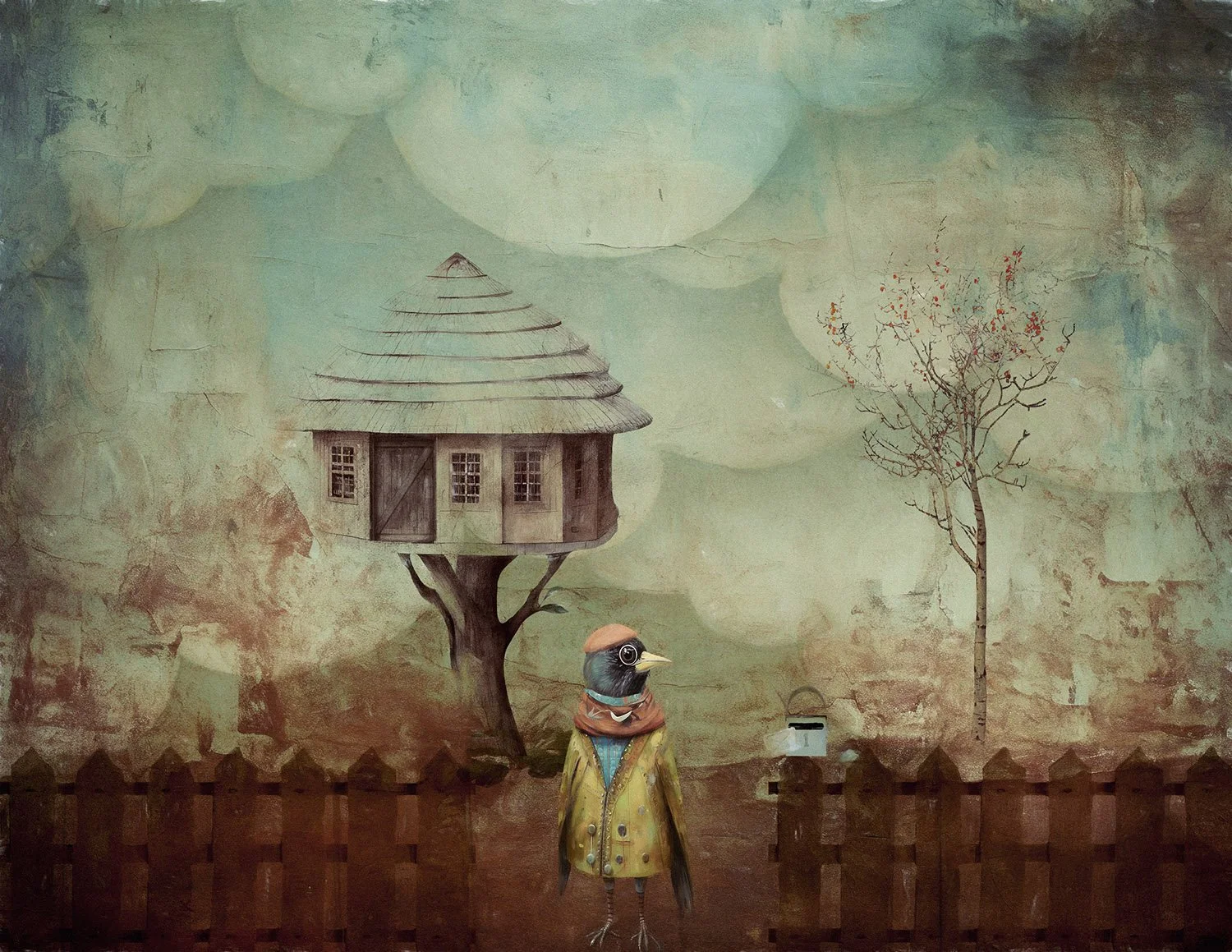
Mr Pigden
In crafting this composite, I employed both warm and cool colour palettes. The primary tones lean towards warmth, complemented by subtle injections of cooler colours for balance. Throughout my workflow, I intentionally made colour decisions during the grading process to achieve the desired visual harmony. I combined several digital textures to add depth and colour balance.
Welcome to the vibrant world of warm hues in digital editing and art! Beyond being a stylistic choice, a warm colour palette is a powerful tool that stirs emotions, sets ambiance, and takes your creations to new heights.
Definition of Warm Colour Palette
A warm colour palette refers to the use of colours that evoke a sense of warmth, such as reds, oranges, and yellows. These colours are positioned on the warmer side of the colour wheel, giving a sense of energy, vibrancy, and heat. The warm colour palette is known for its ability to convey emotions, create visual interest, and establish a particular mood within an artwork.
Importance of Colour in Digital Art
Colour plays a pivotal role in the world of digital art, serving as a powerful tool for communication and expression. The careful selection and arrangement of colours can influence the viewer's emotions, perceptions, and overall experience with an artwork. In digital art, colour choices contribute to the narrative, convey symbolism, and guide the viewer's gaze.
Overview of Using Warm Colours in Digital Art

Rocky The Ringmaster
While cooler colours take the lead as the dominant palette, I incorporated warm tones strategically as accents. This addition guides the viewer's gaze, creating a dynamic interplay of interest and ensuring a harmonious colour balance throughout the image.
Using warm colours in digital art involves a deliberate and thoughtful approach to colour selection, as these hues have distinct psychological and visual effects. Warm colours can create a sense of intimacy, energy, and positivity within an artwork. Artists often use warm colour palettes to convey themes such as passion, excitement, and warmth.
Understanding Warm Colours
Definition of Warm Colours (Reds, Oranges, Yellows)
Warm colours take in a spectrum of hues that evoke a sense of heat, energy, and vibrancy. Primarily found on the red, orange, and yellow segments of the colour wheel, these hues are visually stimulating and contribute to the overall mood and atmosphere of a digital artwork. Red, often associated with passion and intensity, can range from deep crimson to bright scarlet. Orange embodies warmth and enthusiasm, while yellow exudes positivity and energy. Collectively, these warm colours form a palette that can be harnessed for its emotional and visual impact in digital art.
Psychological Impact of Warm Colours
Warm colours exert a psychological influence on the viewer, giving a range of emotions and responses. Reds are known to stimulate and energize, provoking feelings of passion, excitement, and urgency. Oranges radiate warmth, giving a sense of friendliness and enthusiasm. Yellows, associated with sunlight, convey joy, positivity, and optimism. Collectively, warm colours have the power to create a visually dynamic and emotionally charged experience for the audience, making them an invaluable tool in the digital artist's palette.
Conveys Warmth and Comfort
One of the primary advantages of utilizing a warm colour palette in digital art is its ability to convey a sense of warmth and comfort. Warm colours, such as reds, oranges, and yellows, create an inviting and cozy atmosphere within the artwork. This warmth can evoke a feeling of familiarity and connection, establishing an emotional resonance with the viewer.
Evokes Emotions and Energy
Warm colours have a profound impact on the emotional response of the audience. They can evoke a range of emotions, from passion and excitement to happiness and enthusiasm. By strategically incorporating warm hues, digital artists can infuse their creations with a vibrant energy that captivates the viewer and enhances the overall emotional experience of the artwork.
Creates a Focal Point in the Artwork
Warm colours possess the innate ability to draw attention and create focal points within a composition. When strategically placed, these hues can guide the viewer's gaze to specific elements or areas of the artwork. This characteristic makes warm colour palettes effective for emphasizing key details, conveying messages, and directing the narrative focus within a digital piece.
Contrast and Emphasis

Foggy Lane
The colour scheme leans towards cool tones, punctuated by warm highlights to emulate light. The introduction of yellow and orange hues in the windows serves as a focal point, guiding the viewer's gaze into the scene and providing a counterbalance to the overall mood.
Utilise contrast to enhance the impact of warm colours. Contrast can be achieved through the juxtaposition of warm hues against cooler tones or through variations in brightness and saturation. This helps create emphasis and ensures that the warmth stands out prominently in the artwork.
Complementary Colours to Enhance Warmth
Introduce complementary colours strategically to enhance the warmth of the palette. Cooler colours, such as blues and greens, can create dynamic contrasts that amplify the impact of warm hues, adding complexity and interest to the digital artwork.
Adjusting Color Saturation and Temperature

“Yellow” inspired by a song
The predominant color and tones encompass a range of warm shades, with subtle splashes of cool colors for added balance without overpowering. Navigating within a single color palette presents its challenges, yet it imparts a unique visual appeal, offering a distinct look and feel.
Fine-tune colour saturation and temperature settings to achieve the desired intensity and warmth. This level of control allows artists to tailor the colour palette to suit the mood and atmosphere of their digital creations.
Using Brushes and Textures to Enhance Warmth
Incorporate specialized brushes and textures to enhance the warmth of specific elements within the artwork. Texture overlays and brush strokes can add tactile qualities to warm colours, creating a more immersive visual experience.
Incorporating Warm Tones in Backgrounds and Foregrounds
Consider the placement of warm tones in both backgrounds and foregrounds to create a sense of depth and spatial awareness. By strategically positioning warm colours, artists can guide the viewer's perception and establish a visually engaging hierarchy within the composition.

Inspired by the colours and shades of Tuscany. The colours of the buildings are so earthy and they add a pop of colour in the landscape. These textures add depth of colour and subtle texture to give a richness in your creative images.
These textures can be used anywhere in your workflow, beginning, middle or end. Use textures with different blend modes and opacity for subtle effects or use them full strength for a bold statement. The bonus variations give you even further artistic choices.
What is included:
These textures are designed with a deep rich texture finish, add colour AND tone to your image. I use these texture overlays for colour grading as well.
6 Textures handcrafted by me using my own photos and brushes
High quality JPEGS around the 5000px on the longest edge
Print quality at 300 dpi
Downloading your Textures
You will receive an email with the downloadable link, once payment is confirmed. This link is only available for 24 hours to download.
Maintaining Balance with Other Colour Palettes
Incorporating warm colours should be a conscious decision within the broader context of the artwork. Artists must consider how the warm palette integrates with other colour schemes present in the composition. Striking a harmonious balance between warm colours and cooler tones or neutrals can enhance the overall visual appeal and prevent a monochromatic or imbalanced appearance.
Color Palette Generators
Look for the tools to help you work with colour.
Coolors: An online colour palette generator that allows artists to explore and create harmonious colour schemes, including warm palettes.
Adobe Color Wheel: Part of the Adobe Creative Cloud suite, this tool facilitates the creation of custom colour palettes, aiding artists in experimenting with warm colour combinations.
These tools provide digital artists with the resources needed to explore, manipulate, and optimize warm colour palettes in their creative endeavours. Experimenting with different software and tools allows artists to find the most suitable platforms for their individual preferences and workflows.
A Journey Through the Vibrancy of Warm Palettes
In the realm of warm colours, we've uncovered their transformative impact in digital art. From evoking emotions to crafting dynamic focal points, warmth breathes life into your creations. As we wrap up, remember the beauty lies not just in visual appeal but in the stories they tell. So, embrace warmth in your palette, let creativity ignite, and paint a vibrant world. Happy creating!
More information on Colour for you to read