Tone Before Colour: Why Light and Dark Shape Your Images
Tone is doing the work here — the separation between the sky, subject, and ground holds the image together.
When we talk about colour in images, it’s often the first thing we notice — warm or cool, muted or bold, harmonious or contrasting. Colour gets our attention. But underneath every colour image is something quieter and more important: tone.
Tone is the relationship between light and dark. It’s what gives an image structure, depth, and mood. When tone isn’t working, colour struggles to do its job — no matter how carefully chosen the palette is.
This is why images can sometimes feel flat, heavy, or unsettled, even when the colours themselves are “nice”.
What we mean by tone
Tone sits on a scale from white to black, with a wide range of greys in between. Most images don’t need the full tonal range — they need intentional placement.
Highlights draw attention
Midtones hold most of the detail and story
Shadows create depth and grounding
Strong images tend to live comfortably in the midtones, using highlights and shadows as support rather than extremes.
Why colour depends on tone
Every colour has a tonal value. Even in a full colour image, Photoshop is constantly working with light and dark underneath the colour information.
This is why:
Presets and LUTs don’t always work as expected
AI images can feel muddy or harsh
Colour grading sometimes exaggerates problems instead of fixing them
If the tonal foundation isn’t right, colour adjustments often end up compensating — and that’s when images start to feel overworked.
Think of tone as the structure of the image.
Colour is the atmosphere you layer on top.
Analogous colour and tonal control
Analogous colour schemes use colours that sit next to each other on the colour wheel — for example blues and blue-greens, or greens and yellow-greens. They’re naturally harmonious and calm, but they also have low colour contrast. Because the colours are closely related, tone has to do more of the work.
Without tonal separation:
Shapes blend together
Depth is lost
The image can feel flat or muddy
When tone is shaped intentionally, analogous colour schemes become subtle, cohesive, and emotionally strong.
Looking at tone in practice
Below are two examples from my own work that show how tone shapes mood and structure, even when the colour palettes are very different.
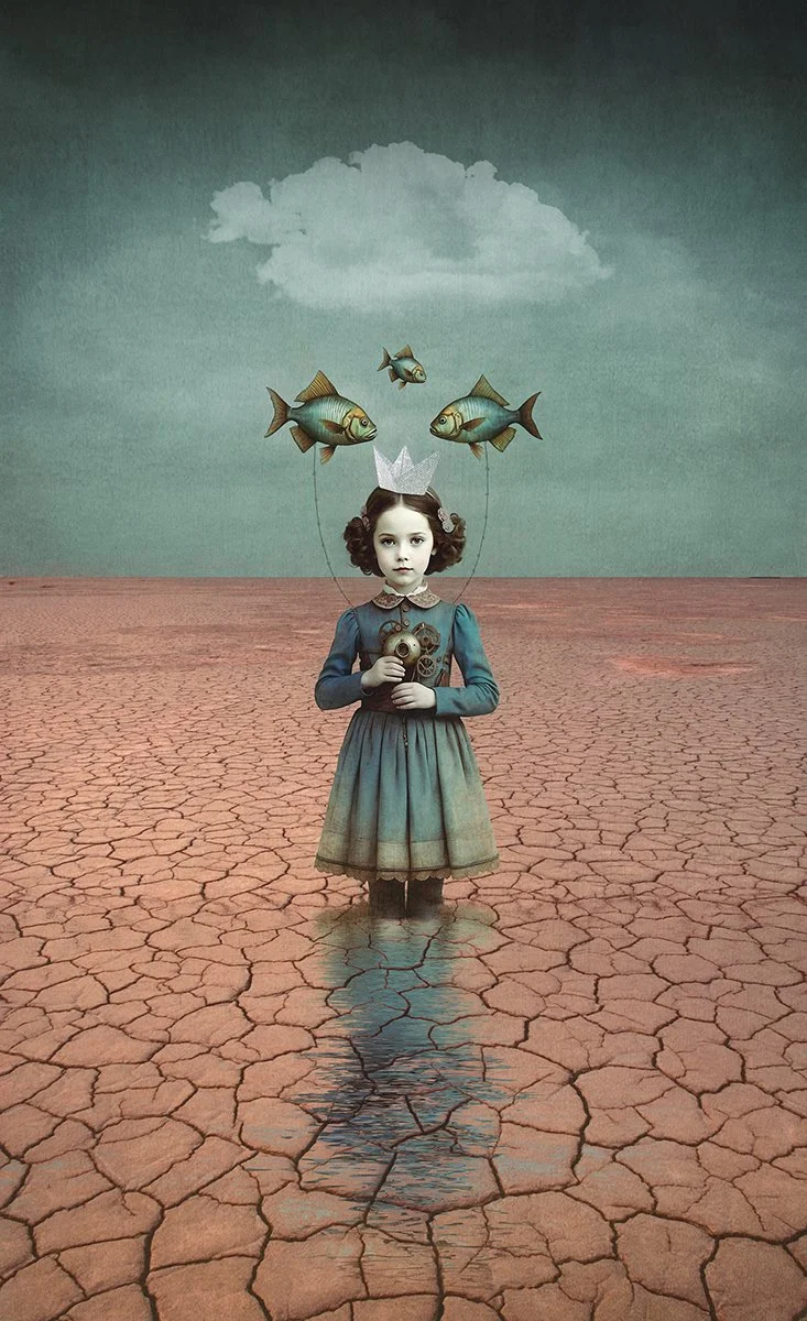
Example 1: This image uses an analogous blue palette, but it’s the tonal contrast — not colour contrast — that gives it structure, mood, and presence. You can watch the full Photoshop workflow for this image on YouTube here.
Example 1:
In this image, the light and dark areas are kept fairly soft.
The highlights aren’t bright white. They’re gentle and subtle, so they don’t overpower the scene.
Most of the image sits in the midtones. This is where the main detail lives, and it’s what gives the image its calm, balanced feel.
The darker areas are there, but they’re controlled. They add depth without becoming harsh or heavy, and there are very few true blacks.
Even though the colours are similar throughout, the image still feels rich and dimensional because the light and dark tones are working well together.
There are no strong opposing colours fighting for attention.
Everything lives in the same cool family, which creates harmony and calm.
Example 2:
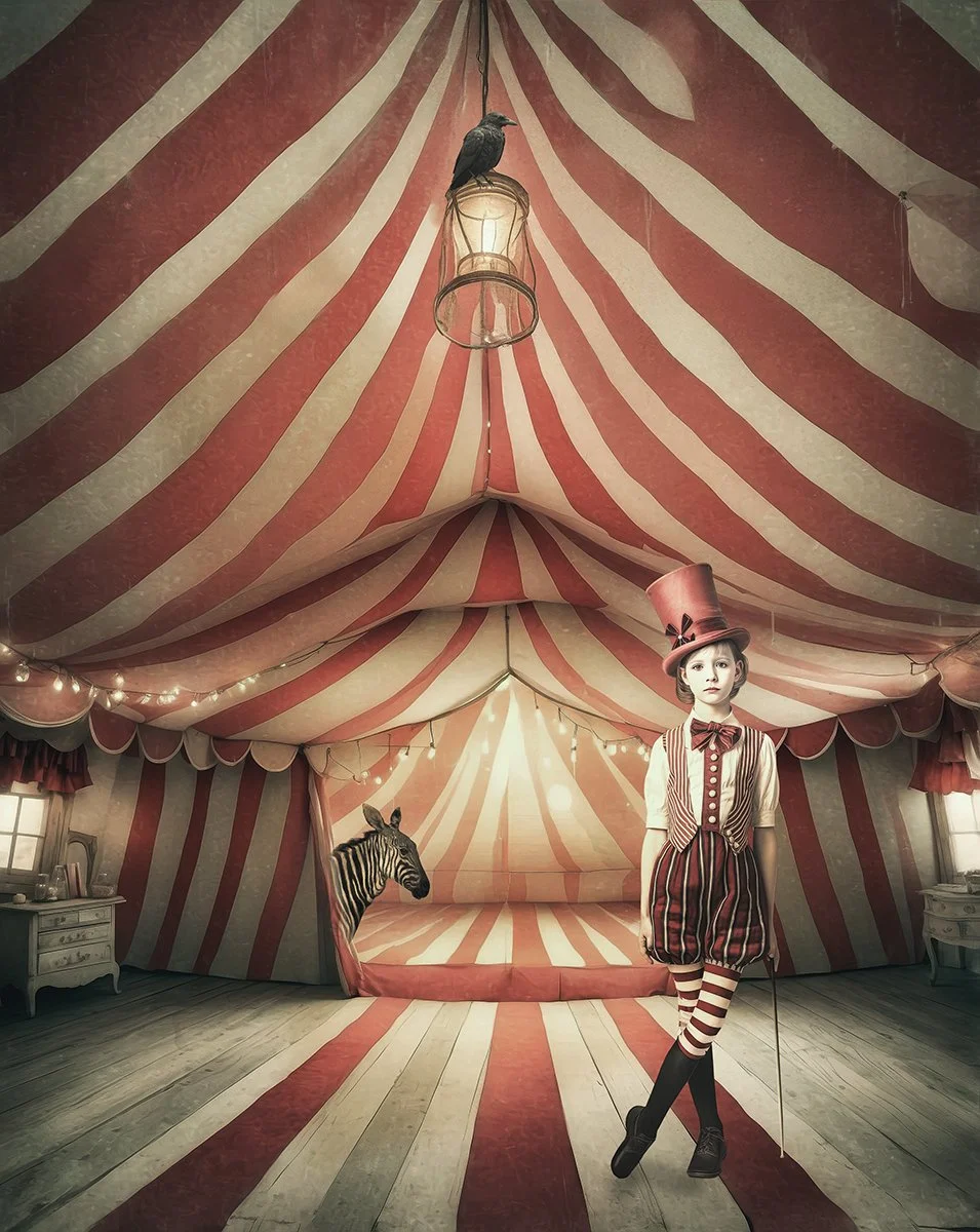
Example 2: This image uses an analogous warm palette built around reds and oranges. Because the colours sit close together on the colour wheel, the scene feels cohesive and immersive, with tonal contrast doing most of the work rather than colour contrast.
In this image, the colour palette stays within a warm, closely related range.
Reds, red-oranges, and soft neutrals repeat throughout the scene, creating a strong sense of visual harmony.
There are no strong opposing colours pulling the eye in different directions, which allows the scene to feel cohesive and immersive.
Tonal contrast does most of the work here. Light and dark areas guide the eye through the image rather than colour contrast.
Highlights are warm and muted, while shadows remain soft, preventing the image from feeling harsh or overly busy.
Even with a limited colour range, the image feels rich and dimensional because tone and texture are working together.
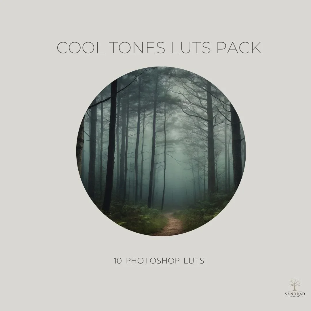
Create soft, atmospheric cool tones with ease.
The Cool Tones LUT Pack includes 10 painterly LUTs designed to bring gentle blues, cool neutrals, and a soft, moody finish to your photos and digital art. Perfect for portraits, landscapes, and composites, these LUTs add depth and harmony in just one click.
What is included:
10 hand-crafted LUTs
Soft blues, cool neutrals, and subtle tones
Video how to use your the LUTS and Instructions how to Install
Adjusting tone in Photoshop: what actually helps
When working in Photoshop, several adjustment layers are especially useful for shaping tone. These adjustments can be global or local, depending on how you use them.
Levels adjust:
Black point
Midtones
White point
By default, Levels is a global adjustment — it affects the entire image. You can make it local by using the layer mask and painting where the adjustment applies.
Levels is excellent for setting the overall tonal foundation.
Curves
Curves gives more precise control over tone:
Highlights
Midtones
Shadows
Like Levels, Curves is global by default, but becomes local when you use the mask. Curves is ideal for shaping contrast gently rather than pushing extremes.
Black & White adjustment layer
Even if you’re not creating a black and white image, this is a powerful tonal diagnostic tool.
Temporarily turning an image black and white helps you:
See tonal balance clearly
Spot flat areas
Identify where separation is needed
This adjustment can be toggled on and off while editing.
Brightness / Contrast
This adjustment is global and more blunt. It can be useful in small amounts, but it doesn’t offer the same control as Levels or Curves. I tend to use it sparingly, and usually reach for Levels or Curves instead.
Dodge & Burn (via Curves or Overlay layers)
Dodging and burning is a local tonal adjustment. It allows you to:
Lighten specific areas
Deepen shadows selectively
Guide the viewer’s eye
This is especially effective with analogous colour palettes, where tonal separation matters more than colour contrast.
Once you understand how these tools affect tone, the next step is knowing where to apply them.
Global vs local: what’s the difference?
Global adjustments affect the entire image
Local adjustments affect only selected areas
Most tonal adjustment layers start global — the control comes from how you use masks.
A simple workflow is:
Establish overall tone globally
Refine and shape tone locally
This keeps edits intentional rather than reactive.
A simple tonal habit to try
Before adjusting colour:
Squint at your image
Or temporarily convert it to black and white
Ask where the highlights, midtones, and shadows sit
If the tone feels balanced, colour becomes much easier.
Strong images aren’t built on extremes
They’re built on thoughtful tonal decisions. When you learn to see tone clearly, you stop guessing — and start editing with purpose.
You might also like: