Opacity, Fill, and Flow — What’s the Real Difference in Photoshop?
Opacity, Fill & Flow — The Photoshop Trio That Everyone Mixes Up (Until Now)
Ever looked at those little sliders in Photoshop — Opacity, Fill, and Flow — and thought, aren’t they the same thing? You are not alone. They sound similar, they all make things more transparent, but how they work — and when to use them — can change your whole editing process.
Let’s break it down in real-world language.
Layer Opacity — Turning down the whole layer!

Think of Opacity like dimming the lights on everything that is on that layer — images, paint, effects, the lot. If you have a texture layer sitting on top of your photo and it is too strong, reducing Opacity is like saying, “Just calm down a bit.” Everything fades evenly.
Use it when:
You are blending textures or overlays and need them to feel more natural.
You have added an adjustment layer that’s just a touch too powerful.
You want to softly merge two images in a composite.
Why it matters:
It’s your go-to for gentle control. You’re adjusting the whole layer, so it’s quick and easy — but not ideal if you want effects (like shadows or glows) to stay strong while the main image fades. That’s where Fill steps in.
Fill — Same slider, different story!
Fill looks like Opacity, until you add a layer style — like a Stroke, Bevel, or Drop Shadow.
Here’s the magic: Fill only fades the actual pixels (or paint) on the layer, not the styles you’ve applied to it.

Try this:
Type some text.
Add a Bevel & Emboss.
Drop the Fill to 0%.
The text itself disappears, but the bevel stays!
It’s like invisible ink that still casts a shadow.
Use it when:
You’re designing text or graphic elements and want to show the style but not the base shape.
You’re creating metallic or embossed looks.
You want creative effects that look layered or dimensional.
Why it matters:
Opacity fades everything. Fill gives you creative separation between the paint and the effects — a small difference that opens big design possibilities.
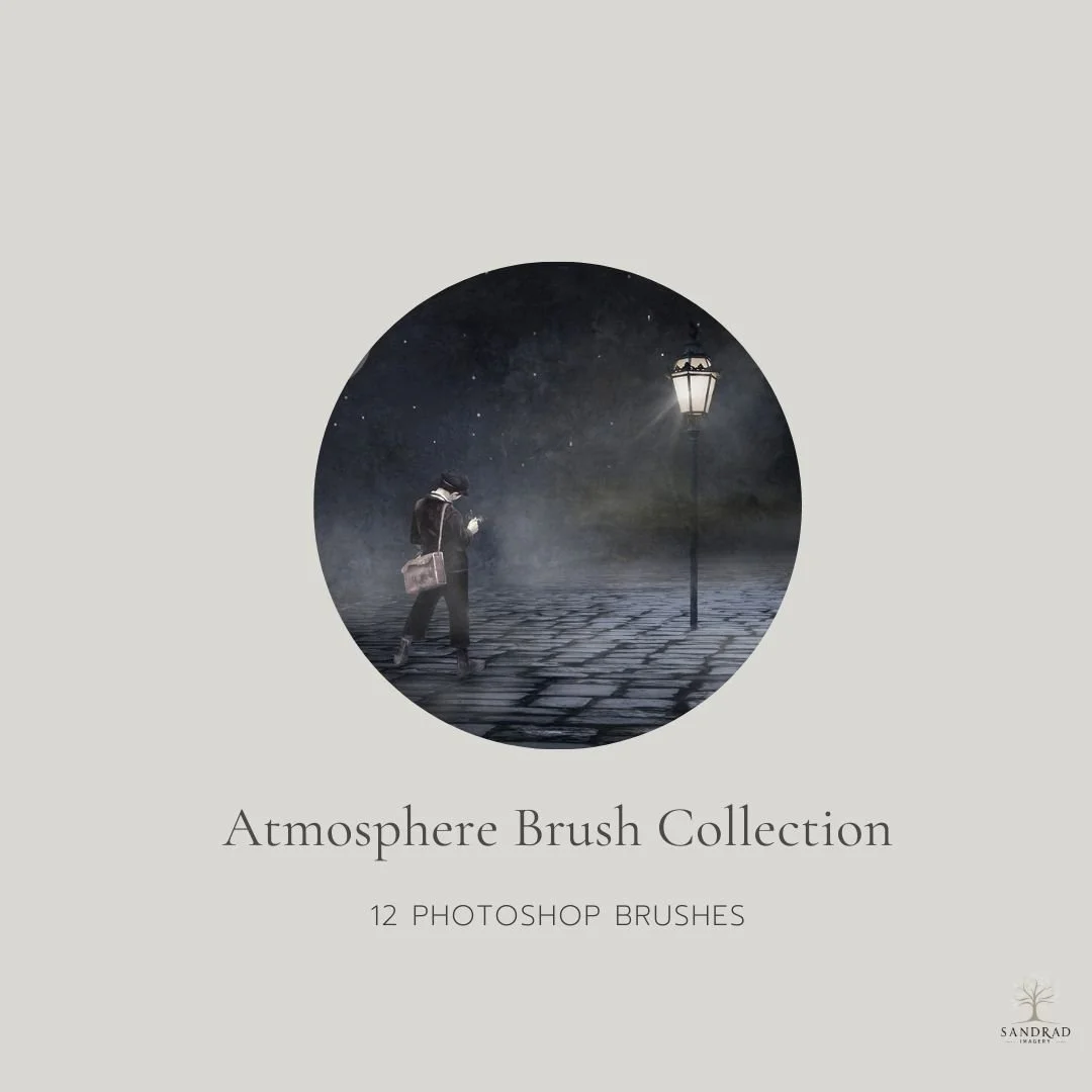
This Pack is a set of 12 Brushes that can be used to create mood, atmosphere, enhance areas of your photo’s (such as landscapes/seascapes and more ) OR add atmosphere to your composite images by adding mist/fog/waves and more.
Delivery: Instant Download
Scroll down to see all the details!
You might be interested in this:
Brush Opacity — Transparency per stroke
When you are painting, Brush Opacity decides how transparent your paint is per brush stroke. If you set it to 50%, each stroke is semi-transparent — but painting over the same area without lifting your pen or mouse will not make it darker. Once you release and paint again, Photoshop resets that stroke.
Use it when:
You want consistent transparency — like softly painting light or shadow.
You are colour-tinting or glazing over an image.
Why it matters:
It is perfect when you want control and repeatability — each stroke behaves predictably.
Brush Flow — How fast the paint builds up
Flow controls how quickly paint builds up while you paint. If Opacity is like choosing how see-through your paint is, Flow is like controlling how much comes out of the airbrush.
Low Flow lets you build tone slowly without lifting your brush — great for subtle shading, skin retouching, dodging, and burning.
Use it when:
You are painting or retouching with gradual buildup.
You want smooth transitions in tone or light.
You are creating painterly or atmospheric effects.
Why it matters:
It gives you finesse. You are sculpting light and texture with control — especially when working with a stylus where pressure sensitivity can enhance Flow even more.
Play with the different sliders
Opacity, Fill, and Flow are all about control — not confusion. Once you know which one does what, you can decide if you want to soften a whole layer, hide just the pixels, or control how your paint behaves.
Small settings, big difference.
These little sliders might not sound exciting, but once you get to know them, they’ll become your best friends in Photoshop. Whether you’re softening a texture, fading a brush, or adding that final whisper of light — knowing when to use Opacity, Fill, or Flow will save you time and give your work that polished, intentional finish.
You might also like: