Muted Colour Magic
Muted colours have a subtle charm that can add depth and sophistication to digital art. Unlike vibrant hues, muted tones are more understated, evoking emotions and atmospheres in a delicate yet powerful way.
In this blog, we’ll explore how to effectively use muted colours in your digital art.
Understanding Muted Colours
Muted colours are tones that have been desaturated, often appearing softer or slightly greyed. They lack the intense brightness of primary colours, making them ideal for creating a calm, moody, or vintage feel in your artwork. Think of pastel shades, earthy tones, and soft neutrals – these are all examples of muted colours.
Choosing Your Palette
When selecting a muted colour palette, start by choosing a base colour and then desaturate it. You can do this in Photoshop by adjusting the Hue/Saturation settings or using the Color Picker tool to manually select a more subdued version of your chosen hue. Combining muted colours can create a harmonious and cohesive look, so consider using analogous or complementary colours for a balanced palette.
Creating Depth and Atmosphere
Muted colours are perfect for creating depth and atmosphere in your art. Use them to build layers and add dimension to your pieces. For instance, in a landscape painting, you can use muted blues and greens for the background to create a sense of distance, while slightly more saturated but still muted colours can be used in the foreground to draw the viewer’s eye.
Balancing with Contrasts
While muted colours can create a serene and unified look, incorporating contrasts is essential to avoid a flat appearance. Use darker or lighter muted shades to highlight certain areas and add visual interest. For example, pairing a muted lavender with a soft grey can create a gentle yet striking contrast.
Textures and Brushwork
The use of textures and brushwork can enhance the effect of muted colours. Experiment with different brushes in Photoshop to add texture to your artwork, making the muted colours more dynamic. A textured background or subtle brush strokes can prevent muted tones from looking too plain or washed out.
Emphasizing Mood and Emotion
Muted colours are incredibly effective in conveying mood and emotion. A predominantly muted palette can evoke a sense of nostalgia, melancholy, or tranquillity. When creating a piece, think about the emotion you want to convey and choose your colours accordingly. For instance, muted blues and greens can create a peaceful, serene atmosphere, while muted reds and browns can evoke warmth and coziness.
Practical Tips for Photoshop
Adjustment Layers : Use adjustment layers like Hue/Saturation, Colour Balance, and Curves to tweak your colours until you achieve the desired muted effect.
Blend Modes : Experiment with blend modes to layer colours and create unique effects. Overlay and Soft Light blend modes can help in achieving a soft, muted look.
Gradients and Overlays : Incorporate gradients and texture colour overlays to unify your colour palette and enhance the overall mood of your piece.
Using muted colours in digital art is a powerful way to create sophisticated, emotionally resonant pieces.
By understanding how to choose and balance these colours, and by using textures and contrasts effectively, you can master the art of muted palettes.
So, next time you start a new digital artwork, consider the quiet elegance of muted colours – they might just become your new favourite tool in your creative arsenal.
Examples of Well-Known Art Using Muted Colors
Muted colours have been used masterfully in various art forms throughout history, contributing to the mood, depth, and emotional resonance of the pieces. Here are some renowned examples:
James McNeill Whistler - "Whistler's Mother" (1871)
Whistler's famous painting, officially titled "Arrangement in Grey and Black No. 1," is a prime example of muted colour use. The predominantly grey and black tones create a sombre, reflective mood, highlighting the solemnity and dignity of the subject.
Claude Monet - "Impression, Sunrise" (1872)
Monet's iconic work that gave the Impressionist movement its name uses a palette of muted blues and greys with a subtle hint of orange. The muted colours evoke a sense of early morning mist and calm, enhancing the impressionistic feel of the piece.
Andrew Wyeth - "Christina's World" (1948)
Wyeth's painting features a palette of muted earth tones that perfectly capture the rural landscape and the emotional weight of the scene. The subdued colours convey a sense of isolation and introspection, drawing the viewer into Christina's world.
Edward Hopper - "Nighthawks" (1942)
Although Hopper's "Nighthawks" is known for its striking use of light and shadow, the colour palette is largely muted. The soft yellows, greens, and browns create a sense of quiet and solitude, amplifying the painting's depiction of urban isolation.
Giorgio Morandi - "Still Life" (1956)
Morandi's still life paintings often feature a range of muted colours. His use of soft, desaturated tones creates a sense of tranquillity and timelessness, emphasising the simplicity and beauty of everyday objects.
Vilhelm Hammershøi - "Interior with Young Woman from Behind" (1904)
Hammershøi's works frequently employ muted greys, whites, and browns. In this painting, the muted colour scheme contributes to the serene, introspective atmosphere, highlighting the quiet elegance of the interior space.
Caspar David Friedrich - "The Monk by the Sea" (1808-1810)
This Romantic masterpiece uses a palette of muted blues and greys to evoke a sense of vastness and solitude. The subdued colours enhance the emotional impact of the solitary figure contemplating the infinite sea and sky.
Loish (Lois van Baarle)
Lois van Baarle, known as Loish, is a digital artist whose work often features a soft, muted colour palette. Her dreamy and ethereal illustrations use gentle hues to create a sense of calm and wonder. Loish's skilful use of desaturated colors enhances the emotional and atmospheric qualities of her art.
Pascal Campion
Pascal Campion is renowned for his heartwarming and nostalgic illustrations. His use of muted colours, combined with strong lighting, creates a cozy and inviting atmosphere. Campion's ability to capture everyday moments with a touch of magic is amplified by his choice of subdued tones.
These artists demonstrate the versatility and beauty of muted colors in creating evocative and atmospheric art. Their work serves as an inspiration for anyone looking to explore the power of a subdued palette in digital creations.

Sailing
A composite created using a combination of AI Images and my photos. The colour grading was done later in processing to give a vintage colour and tone, but with muted colours
Nothing like Home
A composite created with a art background (royalty free) stock and my own photos. Inspired by the colours of Turner.

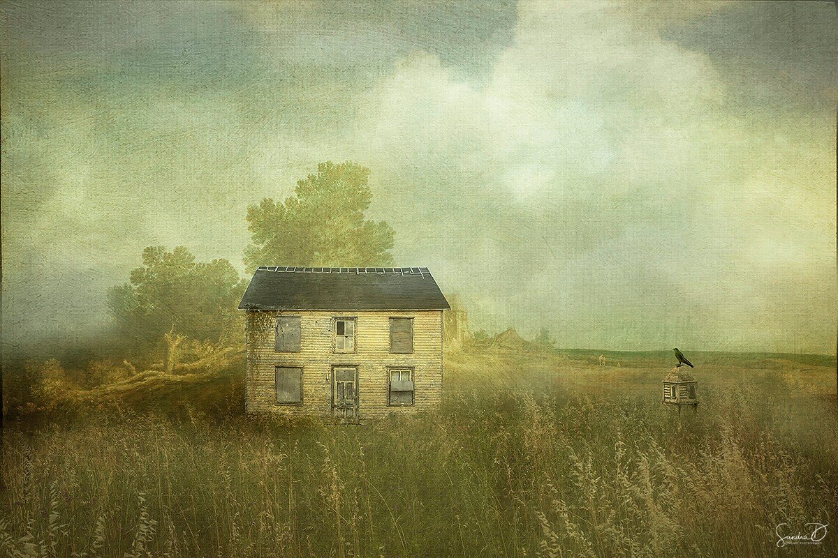
Parker
Combination of AI imagery, textures and the use of presets and various colour grading techniques to get the soft muted colours.
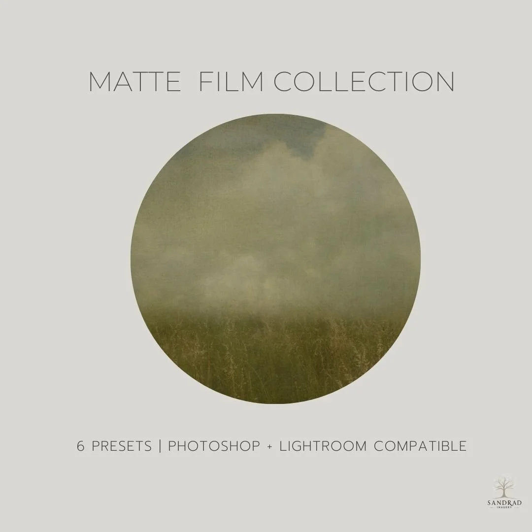
Introducing the Matte Photoshop Presets—a collection of hand crafted presets for digital art and photography, Matte presets are designed to create a matte effect, characterised by soft, muted colours and reduced contrast, often resulting in a vintage or nostalgic aesthetic. These presets typically adjust elements like colour saturation, brightness, contrast, and tone curves to achieve the desired matte look.