 Image 1 of 3
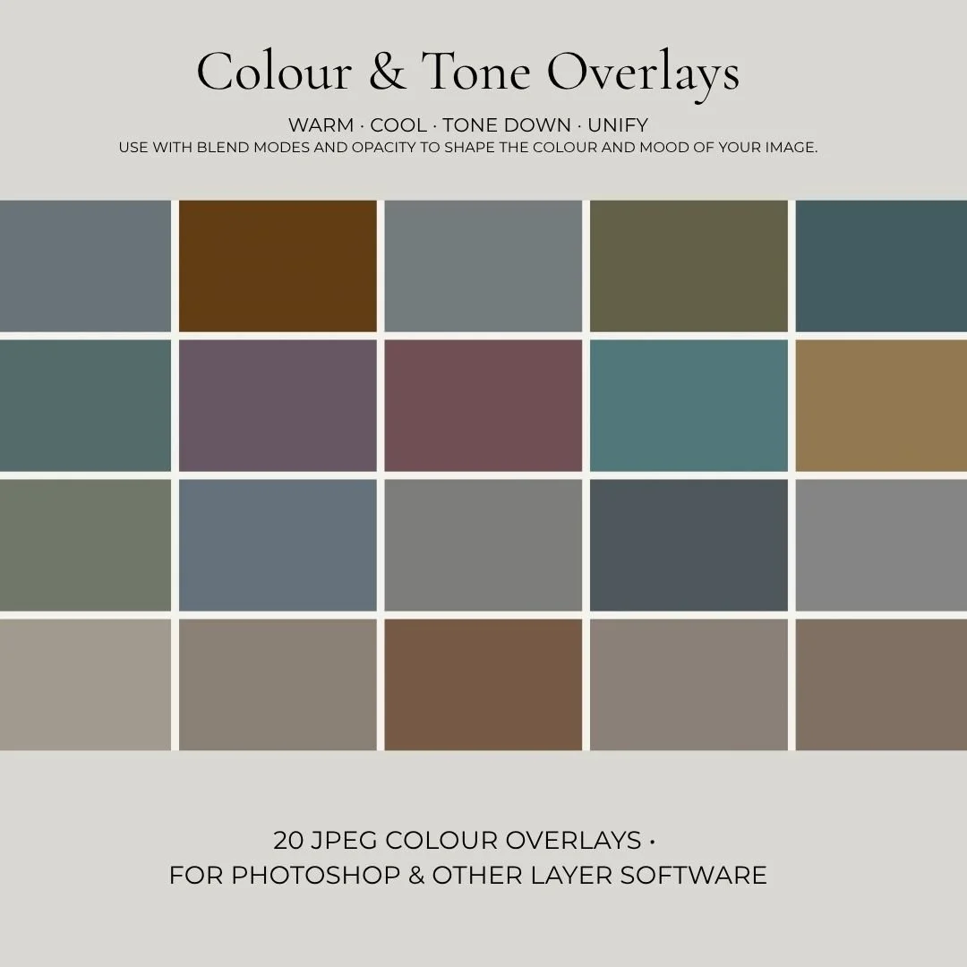 Image 2 of 3
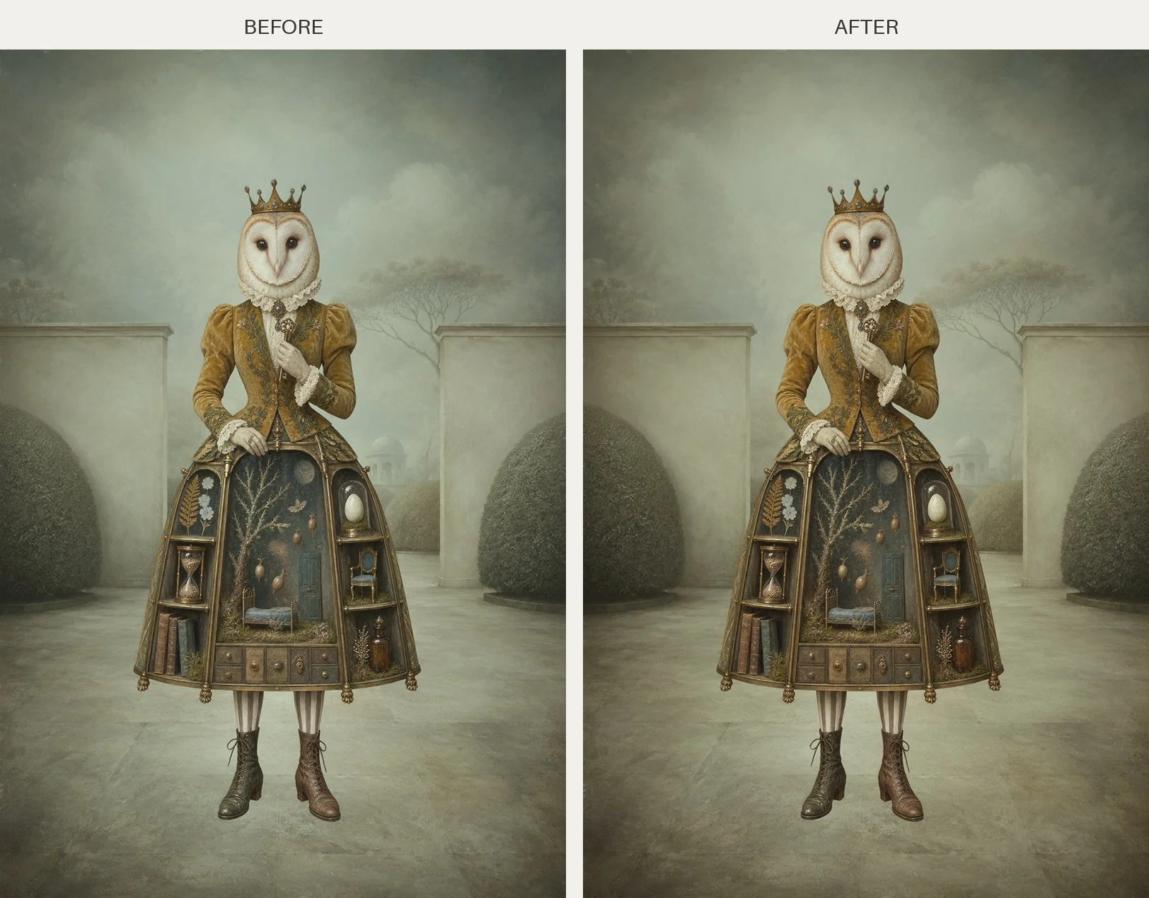 Image 3 of 3
Sometimes a composite or digital artwork just doesn't quite come together. The individual elements may work, but something still feels disconnected.
Colour can be the missing piece.
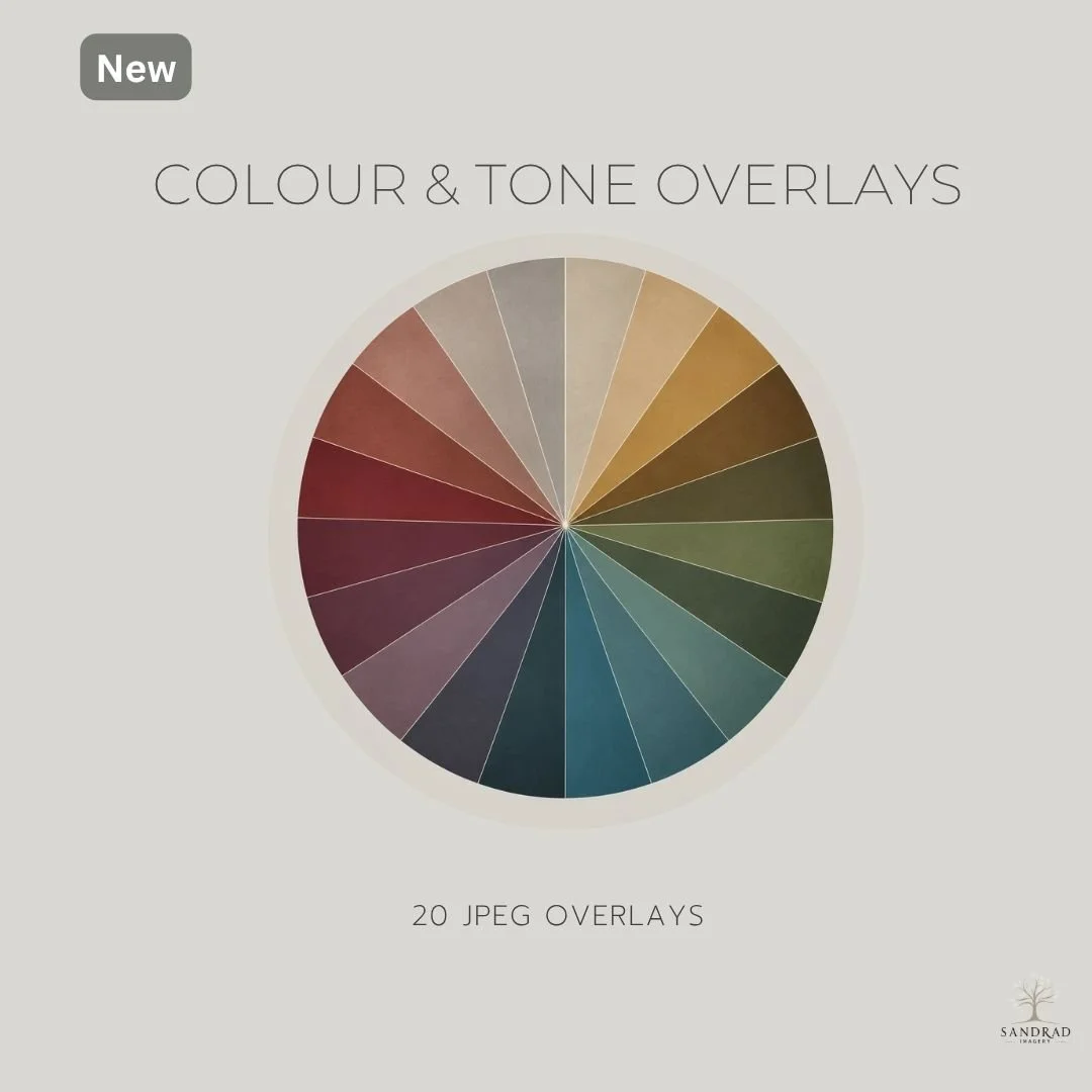
Colour & Tone Overlays is a collection of 20 carefully curated JPEG overlays designed to help warm, cool, tone down and unify colour across an image, while adding colour depth and mood.
These aren't random colours I've simply chosen because I like them. They are based on the muted, earthy and atmospheric tones I use in my own digital artwork to help different elements sit together and create a more cohesive finished image.
Use the overlays to:
Unify a composite by introducing a common colour across different elements.
Warm or cool an image when the overall colour balance doesn't feel right.
Tone down strong or competing colours without simply removing the colour.
Add colour depth and mood to digital artwork and photography.
Recolour a texture — place an overlay over a favourite texture when you love the texture but its original colour doesn't suit your artwork.
Experiment with blend modes and opacity to create anything from a very subtle shift to a stronger colour treatment.
What is included
20 Colour & Tone Overlays — JPEG format
A carefully curated range of warm, cool and neutral tones
Tip Sheet with simple ideas for using the overlays, including blend modes and opacity
High-resolution files ready to use in your creative workflow
Suitable for Photoshop, Affinity Photo and other image-editing software that supports layers and blend modes
Sometimes a composite or digital artwork just doesn't quite come together. The individual elements may work, but something still feels disconnected.
Colour can be the missing piece.
Colour & Tone Overlays is a collection of 20 carefully curated JPEG overlays designed to help warm, cool, tone down and unify colour across an image, while adding colour depth and mood.
These aren't random colours I've simply chosen because I like them. They are based on the muted, earthy and atmospheric tones I use in my own digital artwork to help different elements sit together and create a more cohesive finished image.
Use the overlays to:
Unify a composite by introducing a common colour across different elements.
Warm or cool an image when the overall colour balance doesn't feel right.
Tone down strong or competing colours without simply removing the colour.
Add colour depth and mood to digital artwork and photography.
Recolour a texture — place an overlay over a favourite texture when you love the texture but its original colour doesn't suit your artwork.
Experiment with blend modes and opacity to create anything from a very subtle shift to a stronger colour treatment.
What is included
20 Colour & Tone Overlays — JPEG format
A carefully curated range of warm, cool and neutral tones
Tip Sheet with simple ideas for using the overlays, including blend modes and opacity
High-resolution files ready to use in your creative workflow
Suitable for Photoshop, Affinity Photo and other image-editing software that supports layers and blend modes