Choosing Colour with purpose
The importance of colour choices stems from the significance of colour to the human mind. Colour creates ideas, expresses messages, spark interest, and generate certain emotions. Some colours hold a universal significance- for example, it is commonly understood that red is a colour for warning and green is means go. But, put together, most people would associate the colour combination of red and green as Christmas. Bright colours tend to set a happy and positive mood, whereas dark colours tend to project the opposite. Within the psychology of colours, warm colours show excitement, optimism, and creativity; cool colours symbolize peace, calmness, and harmony.
Working with the colour
With landscape photography one generally works with the colour in the landscape, you may boost some colours for example the blue in a sky, or green in the grass, you may add magenta or tone down a particular colour, you can add more contrast, adjust the light and exposure and so on.
Why make colour choices when creating a composite image?
What happens when you are creating a composite image made up of several elements, photographed in different light or time of day or you used a mixed media – photographs and digital art? How do you tie all your elements together to work in harmony and look like they blend?
One way is the use of colour and making colour choices in your processing workflow.
There are many tools and techniques to use in Photoshop to fine tune your composite image. However, if you understand how colour works and the relationships, when to make your colour choices in your workflow the finished image you will develop an understanding of colour in your decision making. If you want to learn more about colour grading for composite images have a look at my Composites Basics Video Bundle
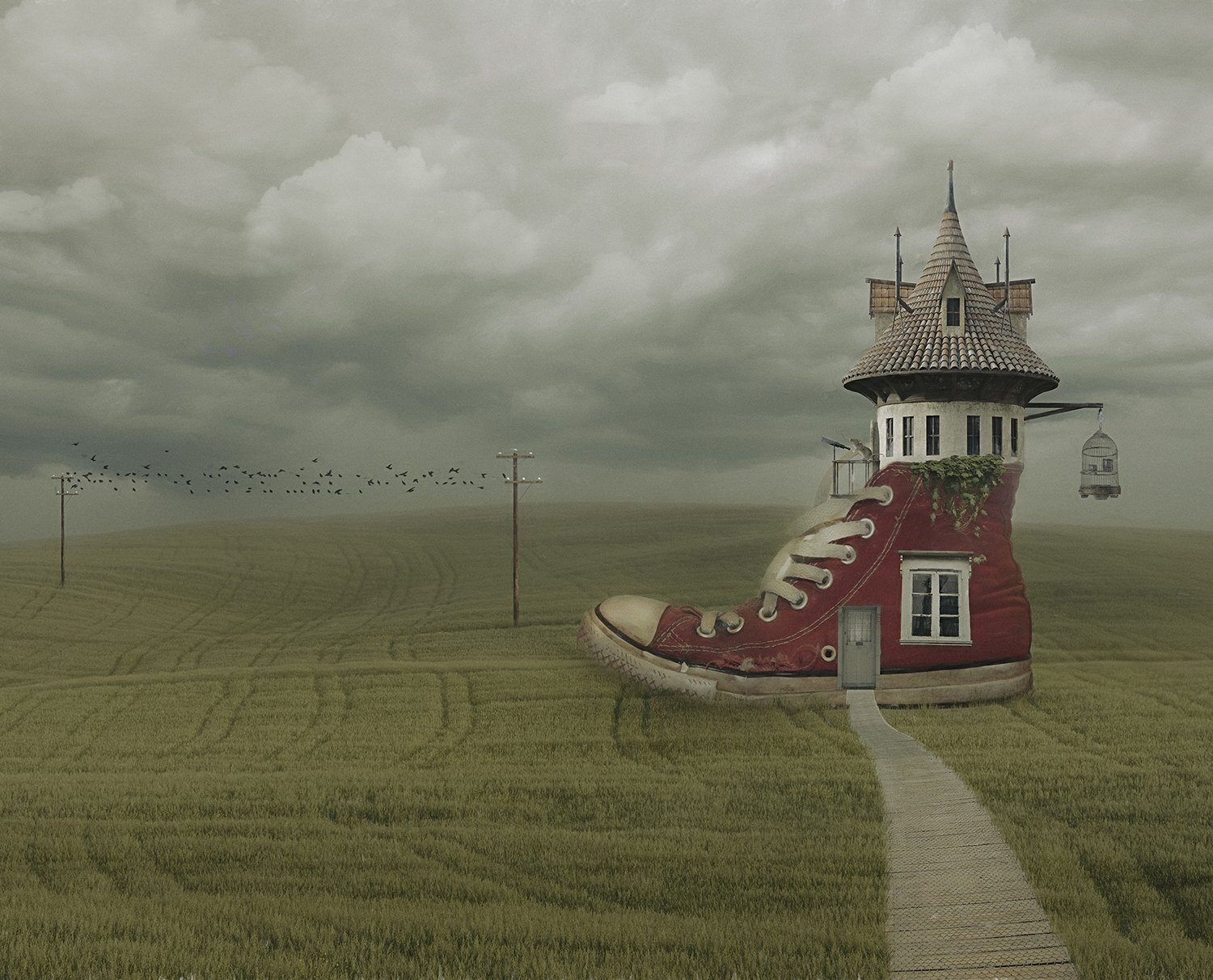
It all started with a shoe

The 3 main base colours I worked with
This composite image started with me choosing an element first – The Red Shoe. I made my colour choices around the red shoe.
The next step was to choose a foreground that would work with the shoe, not to overtake it, but to compliment it. I looked in my “stock library” for backgrounds/foregrounds, I chose a beautiful wheat field photographed in Tuscany, one I loved the soft texture of the wheat and the soft green colour.
Why did I choose a green foreground?
Green And Red Are Complementary Colours
When it comes to the colour wheel, green and red sit opposite each other. These colours are also called complementary colours. Complementary colours are those colours which are “opposites” of each other on the colour wheel.
I made a colour choice for the sky, I had the complimentary colours working together what colour sky should I choose? I chose a moody sky with a muted blue colour, but why?
Red and blue are primary colours and work together, by adding a blue sky I made a colour choice for the base background, and one where I have depth of colour already and can enhance with further colour grading techniques.
Now I worked on placing my elements ~ the window, door, path, house (tower), wire poles, birds, etc. I made colour choices to tie all those elements together.
Once I had the elements working together and matching tonally, I made more colour choices to “colour grade” my image globally (the whole image).
I use different techniques such as hue and saturation, levels, sometimes curves, photo filter adjustment layers, then I might try a colour preset or profile in Adobe Camera Raw, it depends on the image and elements and the mood I wish to create.
For this image I did use an Adobe Camera Profile (included in the latest version of Photoshop) ~ Cinematic 2. Which added a muted colour palette to my composite, using this technique can tie all the different colours and elements together.
Then it is adding the finishing touches to blend it all together and “a shoe is born”.
Working together as a team
◼ By thinking and working with a basic colour principle I could get all my elements working together as a team and syncing in harmony.
◼ By doing this I had the base colours to work with, then I could build up the depth of my colour grading using various techniques in Photoshop.
◼ You need to train that “colour eye” and find what works, what colours you like or make colour choices based on colour principles.
◼ Don’t be frightened to experiment with colour, look around you for colour inspiration ~ look at other photographers, creatives, artists to see how they work with colour. The more you practice and think of colour choices as part of your workflow, the more it becomes natural.
“Life is a painting, and you are the artist. You have on your palette all the colors in the spectrum - the same ones available to Michaelangelo and DaVinci. ”